
SIMPLE NONLINEAR CORRELATION AND REGRESSION Preliminaries Some new tools will be introduced in this tutorial for dealing with nonlinear relationships between a single numeric response variable and a single numeric explanatory variable. In most cases, this involves finding some way to transform one or both of the variables to make the relationship linear. Thereafter, the methods follow those of Simple Linear Correlation and Regression. You might want to review that tutorial first if you are not comfortable with those methods. Although it isn't strictly necessary at this time, as regression problems become more complex, it will become increasingly necessary for you to read the Model Formulae tutorial, as the model to be fit and tested by R will have to be specified by a model formula. You can probably skip it for now, but you'll have to read it if you go any further than this. Kepler's Law It took Johannes Kepler about ten years to find his third law of planetary
motion. Let's see if we can do it a little more quickly. We are looking for a
relationship between mean solar distance and orbital period. Here are the
data. (We have a little more than Kepler did back at the beginning of the 17th
century!)
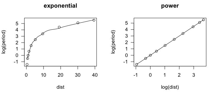
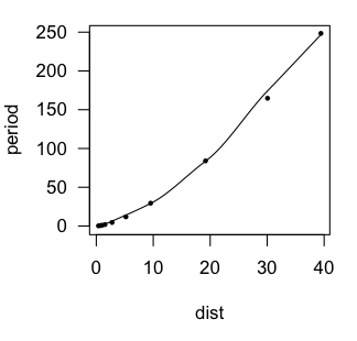
In the scatter.smooth() function, "span=" sets a loess smoothing parameter, "pch=" sets the point character for the plot (16 = filled circles), "cex=" sets the size of the points (6/10ths of default), and "las=1" turns the numbers on the axis to a horizontal orientation. We can see that the loess line is a bit lumpy, as loess lines often are, but it is definitely not linear. An accelerating curve such as this one suggests either an exponential
relationship or a power relationship. To get the first, we would log transform
the response variable. To get the second, we would log transform both variables.
Let's try that and see if either one gives us a linear relationship.
> lm.out = lm(log(period) ~ log(dist), data=planets)
> summary(lm.out)

Call:
lm(formula = log(period) ~ log(dist), data = planets)

Residuals:
       Min         1Q     Median         3Q        Max
-0.0011870 -0.0004224 -0.0001930  0.0002222  0.0022684

Coefficients:
              Estimate Std. Error  t value Pr(>|t|)
(Intercept) -0.0000667  0.0004349   -0.153    0.882
log(dist)    1.5002315  0.0002077 7222.818   <2e-16 ***
---
Signif. codes:  0 '***' 0.001 '**' 0.01 '*' 0.05 '.' 0.1 ' ' 1

Residual standard error: 0.001016 on 8 degrees of freedom
Multiple R-squared:      1,	Adjusted R-squared:      1
F-statistic: 5.217e+07 on 1 and 8 DF,  p-value: < 2.2e-16
The residuals are virtually zero, as is the intercept, and R-squared is 1. I'm
guessing we've nailed this, but let's take a look at a residual plot to see if we
have left any curvilinear trend unaccounted for.
> plot(lm.out, 1) 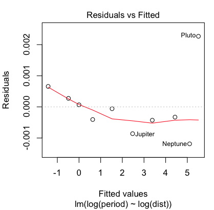
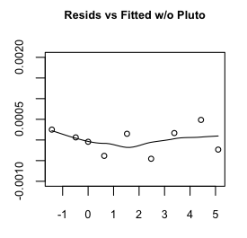
Hmmm, maybe a little bit, but that's mostly due to the oddball (outlier) Pluto,
which does have a somewhat eccentric and inclined orbit. Even so, the size of
the residuals is miniscule, so I'm going to say our regression equation is:
Exponentiating and squaring both sides brings us to the conclusion that the square of the orbital period (in earth years) is equal to the cube of the mean solar distance (actually, semi-major axis of the orbit, in AUs). Had we left the measurements in their original units, we'd also have constants of proportionality to deal with, but all things considered, I think we've done a sterling job of replicating Kepler's third law, and in under an hour as well. If only Johannes had had access to R! Sparrows in the Park Notice in the last problem the relationship between the response and explanatory variables was not linear, but it was monotonic. Such accelerating and decelerating curves suggest logarithmic transforms of one or the other or both variables. Relationships that are nonmonotonic have to be modeled differently. The following data are from Fernandez-Juricic, et al. (2003). The data were
estimated from a scatterplot presented in the article so is not exactly the
same data the researchers analyzed but is close enough to show the same
effects.
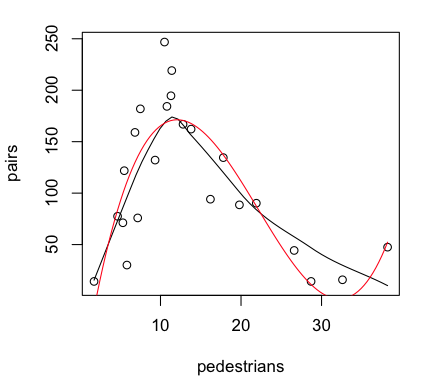
> lm.out = lm(pairs ~ pedestrians + I(pedestrians^2) + I(pedestrians^3), data=sparrows)
> summary(lm.out)

Call:
lm(formula = pairs ~ pedestrians + I(pedestrians^2) + I(pedestrians^3),
    data = sparrows)

Residuals:
    Min      1Q  Median      3Q     Max
-80.756 -17.612   0.822  20.962  78.601

Coefficients:
                  Estimate Std. Error t value Pr(>|t|)
(Intercept)      -91.20636   40.80869  -2.235   0.0376 *
pedestrians       49.69319    8.63681   5.754 1.52e-05 ***
I(pedestrians^2)  -2.82710    0.50772  -5.568 2.27e-05 ***
I(pedestrians^3)   0.04260    0.00856   4.977 8.37e-05 ***
---
Signif. codes:  0 '***' 0.001 '**' 0.01 '*' 0.05 '.' 0.1 ' ' 1

Residual standard error: 39.31 on 19 degrees of freedom
Multiple R-squared:  0.7195,	Adjusted R-squared:  0.6752
F-statistic: 16.24 on 3 and 19 DF,  p-value: 1.777e-05
The cubic term is significant, so if we are going to retain it, we should retain
the lower order terms as well. (NOTE: In the formula interface, we cannot simply
enter pedestrians^2 and pedestrians^3. Inside a formula interface, the ^ symbol
means something else. If we want it to mean exponentiation, we must isolate it
from the rest of the formula using I().) Our
regression equation appears to be:
Provided the graphics device is still open with the scatterplot showing, we
can plot the regression curve on it as follows (the red line in the graph above).
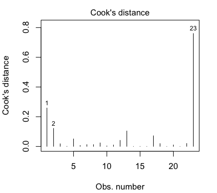
That last point is a highly influential point, with a Cook's Distance of nearly
0.8. We really don't like to have individual points having a strong influence
over the shape of our regression relationship. Perhaps we should check the
relationship with that point deleted, which we can do most conveniently using
the update() function to update the data set that
we used. (We can also use update()
to add or remove variables, add or remove effects such as
interactions, add or remove an intercept term, and so on. More on this in the
next tutorial.)
Vapor Pressure of Mercury In this section we are going to use a data set called "pressure".
To bring this problem into the 21st century, I am going to begin by
converting the units of measurement to SI units. This will also avoid some
problems with log transforms. (Notice the minimum value of "temperature" is 0.
Notice also that the number of significant figures present in the various data
values varies widely, so we are starting off with a foot in the bucket.)
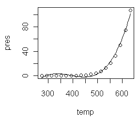
First Thoughts: Log Transformations We begin, as always, with a scatterplot.
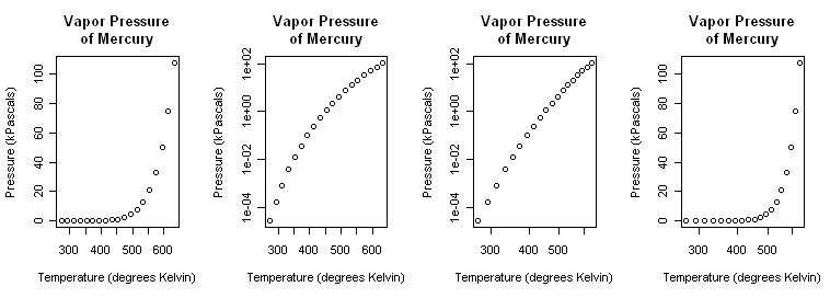
> plot(pres ~ temp, main="Vapor Pressure\nof Mercury",
+                   xlab="Temperature (degrees Kelvin)",
+                   ylab="Pressure (kPascals)", log="xy")
That (third graph) appears to be a little closer but still a bit bowed. A log(x) transform (last graph) is silly but illustrated just to show it. > plot(pres ~ temp, main="Vapor Pressure\nof Mercury", + xlab="Temperature (degrees Kelvin)", + ylab="Pressure (kPascals)", log="x")Close the graphics window now so that it will reset to the default one-graph per window partition. (A trick: After par() opened a graphics window, I resized it by hand to a long, skinny window.) Although we know it's wrong from the scatterplots, let's fit linear models
to the exponential and power transforms just to illustrate the process.
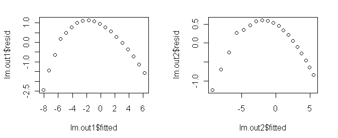
Polynomial Regression A polynomial of sufficient order will fit any scatterplot perfectly. If the order of the polynomial is one less than the number of points to be fitted, the fit will be perfect. However, it will certainly not be useful or have any explanatory power. Let's see what we can do with lower order polynomials. A glance at the scatterplot is enough to convince me that this is not a
parabola, so let's start with a third order polynomial.
All three estimated coefficients are making a signficant contribution to the
fit (and the intercept is significantly different from zero as well), and any
social scientist would be impressed by an R2-adjusted of 0.987, but
the residual plot shows we do not have the right model. To see why, do this.
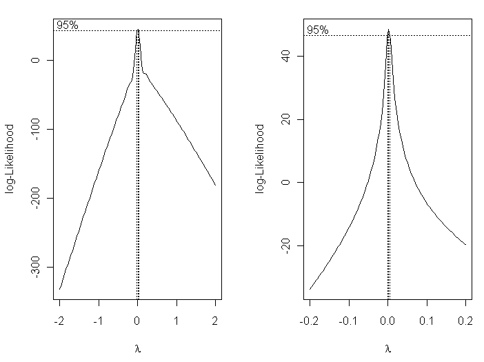
Box-Cox Tranformations When you get desperate enough to find an answer, you'll eventually start
reading the literature! An article I found from Industrial & Engineering
Chemistry Reseach (Huber et al., 2006, Ind. Eng. Chem. Res., 45 (21), 7351-7361)
suggested to me that a reciprocal transform of the temperature might be worth a
try.
Box-Cox transformations allow us to find an optimum transformation of the
response variable using maximum-likelihood methods.
> plot(log(pres) ~ I(1/temp)) 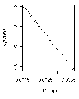 Now that is a scatterplot I can live with! (At right.) On with the modeling!
> lm.out4 = lm(log(pres) ~ I(1/temp))
> summary(lm.out4)

Call:
lm(formula = log(pres) ~ I(1/temp))

Residuals:
      Min        1Q    Median        3Q       Max
-0.074562 -0.029292 -0.002077  0.021496  0.151712

Coefficients:
              Estimate Std. Error t value Pr(>|t|)
(Intercept)  1.626e+01  4.453e-02   365.1   <2e-16
I(1/temp)   -7.307e+03  1.833e+01  -398.7   <2e-16

Residual standard error: 0.04898 on 17 degrees of freedom
Multiple R-squared: 0.9999,     Adjusted R-squared: 0.9999
F-statistic: 1.59e+05 on 1 and 17 DF,  p-value: < 2.2e-16
I'd say we might be on to something here! It appears we have a model regression
equation as follows.
log(pres) = 16.26 - 7307 / temp And a look at the regression diagnostic plots... > par(mfrow=c(2,2)) > plot(lm.out4) > par(mfrow=c(1,1)) 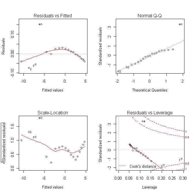
Making Predictions From a Model Predictions for new values of the explanatory variables are made using the
predict() function. The syntax of this function
makes absolutely no sense
to me whatsoever, but I can tell you how to use it to make predictions from a
model. We'll use the previous example as our model that we want to predict
from. First some reference values...
...and now we will make predictions from our model for those tabled values of temperature.
> new.temps = seq(from=400, to=600, by=50)       # put the new values in a vector
> predict(lm.out4, list(temp=new.temps))
          1           2           3           4           5
-2.00803385  0.02159221  1.64529305  2.97377556  4.08084431
The first thing you feed the predict() function
is the name of the model
object in which you've stored your model. Then give it a list of vectors
of new values for the explanatory variable(s) in the format you see above.
The output is not
pressure in kPa, because that is not what was on the left side of our model
formula. The output is log(pres) values. To get them back to actual pressures,
we have take the natural antilog of them.
> exp(predict(lm.out4, list(temp=new.temps)))
         1          2          3          4          5
 0.1342524  1.0218270  5.1825284 19.5656516 59.1954283
Those values are not so terribly far from the ones in the table. Nevertheless,
I have probably just been expelled from the fraternity of chemical
engineers! (Not too bad though, considering that some of our measurements had
only one significant figure to begin with.)
revised 2016 February 16 | ||||||||||||||||||

 Let me explain the model formula first. Three terms are entered into the model
as predictors: temp, temp squared, and temp cubed. The squared and cubed terms
MUST be entered using "I", which in a model formula means "as is." This is
because the caret symbol inside a formula does not have its usual mathematical
meaning. If you want it to be interpreted mathematically, which we do here, it
must be protected by "I", as in the term "I(temp^2)". This gives the same result
as if we had created a new variable, tempsquared=temp^2, and entered tempsquared
into the regression formula. (WARNING: If you have read the tutoral on model
formulae, you might be tempted to think that pres~poly(temp,3) would have
produced the same result. IT DOES NOT!)
Let me explain the model formula first. Three terms are entered into the model
as predictors: temp, temp squared, and temp cubed. The squared and cubed terms
MUST be entered using "I", which in a model formula means "as is." This is
because the caret symbol inside a formula does not have its usual mathematical
meaning. If you want it to be interpreted mathematically, which we do here, it
must be protected by "I", as in the term "I(temp^2)". This gives the same result
as if we had created a new variable, tempsquared=temp^2, and entered tempsquared
into the regression formula. (WARNING: If you have read the tutoral on model
formulae, you might be tempted to think that pres~poly(temp,3) would have
produced the same result. IT DOES NOT!)