Compare the histogram to the table. Which is more informative?
2
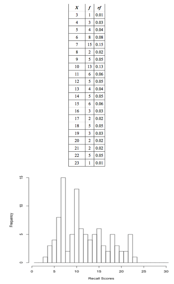
Psyc 480 -- Dr. KingIntroduction to the Basics of StatisticsStatistics is the mathematics of data, and mathematics is the science of patterns. Therefore, we can define statistics as the mathematics--or science--of finding patterns in data. Let's begin with some data that were collected as part of an experiment published in 1974 on incidental learning by Michael Eysenck. He gave 100 subjects a deck of thirty cards with a word written on each card. Subjects were given various instructions that are not important at this time. What is important is that some time later, Eysenck asked his subjects to recall as many of the words as they could remember, without warning in most cases. Each subject was "awarded" a score, a number equal to the number of words he or she was able to recall correctly. Here are the data. Ignore the numbers in square brackets. They are not part of the data but just help us to keep track of where we are in the data set. > recall [1] 6 10 7 9 6 7 6 9 4 6 6 6 10 8 10 3 5 7 7 7 10 7 14 7 13 [26] 11 13 11 13 11 23 19 10 12 11 10 16 12 10 11 10 14 5 11 12 19 15 14 10 10 [51] 7 9 7 7 5 7 7 5 4 7 6 10 6 8 10 7 7 9 9 4 14 22 18 13 15 [76] 17 10 12 12 15 15 16 14 20 17 18 15 20 19 22 18 21 21 18 16 22 22 22 18 15 Quite a mess, isn't it? And this is a fairly small data set. Imagine what we would be looking at if there were a 1000 scores, or 10,000! Can we find a way to organize these data? One thing that probably occurs to you immediately is that we could put the numbers in order from smallest to largest. > sort(recall) [1] 3 4 4 4 5 5 5 5 6 6 6 6 6 6 6 6 7 7 7 7 7 7 7 7 7 [26] 7 7 7 7 7 7 8 8 9 9 9 9 9 10 10 10 10 10 10 10 10 10 10 10 10 [51] 10 11 11 11 11 11 11 12 12 12 12 12 13 13 13 13 14 14 14 14 14 15 15 15 15 [76] 15 15 16 16 16 17 17 18 18 18 18 18 19 19 19 20 20 21 21 22 22 22 22 22 23 Even after this simple operation, we have a much better idea of what we've got. Already we're seeing patterns. The numbers range from 3 to 23, so everybody recalled at least a few of the words, and nobody got them all. The scores near the middle of that range appear to be more numerous, or more frequent, than scores near the top or bottom. There are a lot of 10s and 11s, not many 3s or 23s. I. Frequency Distributions. Let's count how many we have of each value and put that information in a table. The table appears on the next page. The numbers in the first column of the table are the scores, denoted by X in the table, and the numbers in the second column of the table are how often each score occurred in the data, the frequency of the score, denoted by f in the table. (Remember, f = frequency.) Now we can see clearly that numbers near the middle of the range tended to occur more frequently than numbers near the low or high end. So we've clarified the pattern we first saw by sorting, and it's a fairly typical pattern, one we'll see often. Such a table is called a frequency table of the data. Is there any way to better visualize this pattern? Tables are nice, but how about a graphic? What we're going to do is to draw an x-axis with the values 0 through 30 on it (all possible values of X), and a y- axis with the values 0 to 15 on it, which will represent the frequencies. Then for each possible recall score (X), we're going to draw a bar that extends up to the frequency of that score in the data. Such a graph is called a histogram, or frequency histogram. The histogram also appears on the next page. 1 |
Compare the histogram to the table. Which is more informative?
2 |
To draw the histogram, it's as if we took 100 little wooden blocks, wrote one of the scores on each one, and then stacked them over the numbers on the x-axis that correspond to the values written on them. A histogram is essentially "stacked data." The histogram and the table contain the same information, that is, are equally informative, but the histogram is easier to look at. We see immediately where the "peaks and valleys" are. Graphics are usually preferred to tables when organizing data, but not always. If we need to know exactly how many times the value 8 occurred in the data, it would be easier to use the table. Graphs are good for visualizing patterns. Tables are good when precise information is needed. Let's denote the total number of scores, or sample size, by the letter n. In this case, n = 100. There are many more people who could have been tested, but these are the people who were tested, the sample. You may have noticed a third column in the frequency table, headed rf. At least I hope you noticed it! It probably didn't take you long to discover that rf = f / 100. These are called relative frequencies. The relative frequency for each data value is defined as rf = f / n. What good is that? It supplies the same information as the frequency does, but in a slightly different form. Think of a relative frequency as the rate at which a data value occurs. Relative frequency values are frequencies per subject, as it were. They give the proportion of times each data value occurs. Thus, the proportion of values equal to 15 in the data set is 0.06. Multiply a proportion by 100 and you have a percentage (per 100 subjects), so we might also say that 6% of the values in the sample were equal to 15, or 6% of the subjects (6 out of every hundred subjects) recalled 15 words. Add up the relative frequencies, and they add to 1. Always, for any data set (to within rounding error). Add up the percentages and they will always add to 100%, indicating that 100% of the data (all of it) is accounted for in the table. II. Empirical Probabilities. We can draw the histogram using relative frequencies as well, in which case we will have a relative frequency histogram. Notice that it is the same shape as the frequency histogram. When it comes to histograms, shape matters. In fact, shape is kind of the point! 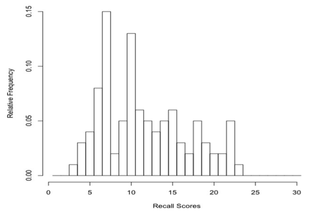
3 |
We can also think of the relative frequencies as probabilities. If we put all our wooden blocks in a hat, thoroughly mix them up, and then draw out one at random, the probability of drawing a block with a certain value written on it would be equal to the relative frequency of that value in the sample. It's best, i.e., most clear-headed, to think of probabilities as predictions of the future. Thus, relative frequencies describe what happened. Probabilities predict what might happen. In the last figure, if we replace the words "Relative Frequency" on the y-axis with "Probabilities," then we have a probability histogram or probability distribution. Probability distributions play a crucial role in statistics, and we will see many more of them. Notice that each bar in the histogram is one unit wide. I drew it that way intentionally. Thus, the area of each bar (it's width times its height) in the relative frequency histogram is equal to the relative frequency. Which as we've just seen can be thought of as a probability. In a probability distribution, the probability of drawing from the hat a block with a particular value written on it is equal to the area of the bar (or is if the histogram is drawn properly). Area is probability. The total area of all the bars in the relative frequency histogram is 1, just as the probability of drawing a block with some value on it out of the hat is equal to 1. In other words, if we draw a block at random out of the hat, it's a sure thing (p = 1) that we are going to get a block that has some value in our sample of values. We're not going to get a block with 112 written on it, because that value is not in our data and, therefore, is not written on any block. Thus, p = 0 (no chance) of drawing that value. Probability is an absolutely critical concept in statistics, and you need to be thoroughly familiar with at least the basic concepts, so thoroughly familiar that they become second nature to you. So study the following sentences and diagram carefully. A probability is always a number between zero and one--it cannot be outside that range. A probability of zero means the event, whatever it is, has no chance of occurring. None! A probability of one means the event is a sure thing. Values between zero and one represent varying degrees of certainty and uncertainty, with p = 0.5 indicating as likely to occur as not. 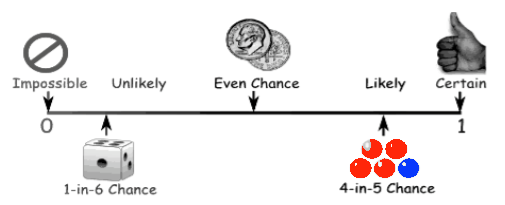
Notice that the probabilities represented by the areas of the bars can be added. Thus, the probability of reaching into the hat and drawing either a 3, a 4, or a 5 is equal to the areas of these three bars summed (or the relative frequencies summed), 0.01 + 0.03 + 0.04 = 0.08. Eight percent of the data values are less than 6. Summing (nonoverlapping) areas under the histogram is the same as getting a "total probability" of pulling something at random out of those areas of the histogram or, more correctly, the probability distribution. 4 |
Notice further that when we stack our data into a histogram, it sort of resembles a mound We have a little mound of data. Our frequency distribution, represented graphically in the form of a histogram, is mound-shaped. That's typical. Most data sets, when we plot them as a histogram, will have a mound- shaped histogram. We say, the distribution of scores is mound-shaped. Meaning the histogram is kind of shaped like a mound. We can even draw a smooth curve over the histogram (below) representing this "mound of data." Distribution, the shape into which our data distribute themselves when stacked into a histogram, is an important idea in statistics, and mound-shaped distributions are not only common, they are generally considered good. We like them. It makes us happy little statisticians when our data fall into this kind of pattern. (Statisticians are easy to please. Sometimes!) 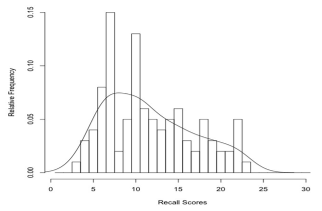
The smooth curve in the figure above approximates the shape of the histogram. In this case, it's not a particularly good approximation, because the histogram is kind of toothy or jagged. But that's the nature of approximations. They're approximate! We do a lot of approximation in statistics, and our approximations are rarely spot on. Get used to it! There is a certain amount of slop in statistics. Sometimes we don't call our approximations by that name. Sometimes we call our approximations estimations. That sounds more technical and less sloppy, but an estimation is just an approximation going by another name. Another not entirely unreasonable name for them would be guesses. The reason our approximations or estimations are not entirely accurate is because we make them from incomplete information. What we have is information about a sample. What we want is information about the population, or general case, everyone who might have been included in the sample. Hopefully, the sample represents the population we're interested in reasonably accurately, a representative sample, but even so it's not going to be a perfect representation. Estimations about populations made from samples contain error. That is, they are not exactly right. This is no one's fault. 5 |
No one has "made an error." The error is unavoidable. One of the important uses of probability in statistics is to try to get an idea of how much error our estimations might contain. To get a little ahead of ourselves in this review, let me give an example. Suppose we are interested in the average IQ of students at Coastal Carolina University. There are about 9000 undergraduate students at CCU, and we can't test them all. We don't have that kind of time, money, or patience. So we draw a sample, and we draw it carefully so that it is a representative sample. Let's say our sample is of size n = 25. We give each of these 25 people an IQ test, and we find that, in our sample, the mean IQ is 118. (I just made that up. I have no idea what the average IQ of CCU students is!) So we say, "According to our sample, the best estimation we can make of the average IQ of students at CCU is 118." But we know that's almost certainly wrong. By how much? Using a method that you should remember from your first stat class, but if you don't, don't worry too much about it as it will be introduced later, we can do a further calculation that allows us to state, "While 118 is probably not the correct value of average IQ of all CCU students, we are reasonably confident that the correct value is between 115 and 121, and we are really confident that the correct value is between 111.8 and 124.2." III. Theoretical Probabilities. We often like to assume that our data distribute themselves into a shape approximated by the smooth curve shown in the following graphic. 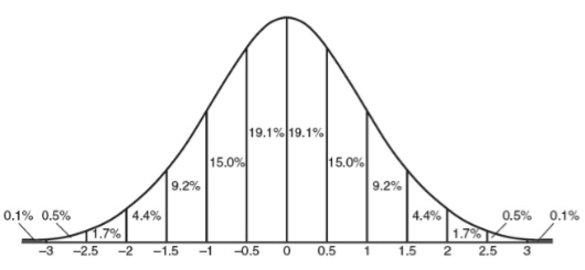
If you've already had even a brief introduction to statistics, then you should certainly recognize this shape as being the standard bell curve, or normal probability distribution. The data values on the horizontal axis have been standardized, and we'll talk about what that means shortly. For now, let's ask an obvious question. Why do we like this shape so much? First, we like it because, as it turns out, it's often not the least bit unreasonable to assume that this shape approximates the shape of our data. Second, we like it because the normal distribution has very precise mathematical properties. If our data are normally distributed, then we know an awful lot about them. The total area under the normal distribution is 1, and as you recall, area is probability. Thus, the total probability that one of our data values chosen at random falls somewhere under that curve is 1 (a sure thing). Since, in theory, the curve stretches from negative infinity on the left to positive infinity on the right, that's really not such a surprising statement! All values fall somewhere between negative and positive infinity! We're not exactly going out on a limb there, are we? 6 |
Notice, however, that values near the middle are much more likely than values near the ends. (The "ends" are called the tails of the distribution, because they look like tails.) Between standardized scores of 0 and 0.5 we find 19.1% of the data values. I.e., the probability that a data value falls in this range is p = 19.1 / 100 = 0.191. Another way of saying the same thing is that the area under the normal curve between standardized scores of 0 and 0.5 is 0.191. Why do areas under the curve represent probabilities? Don't spend too much time puzzling over that! There's no mystery here. That's true because that's the way we've drawn the curve! Other areas are represented similarly in the graphic. So, using this graphic, determine the probability that a standardized score from a normal distribution will fall outside the range -2 to 2. All you have to do is add up the relevant areas. Converting to probabilities in our head, and then adding, we get: p = 0.001 + 0.005 + 0.017 + 0.017 + 0.005 + 0.001 = 0.046 (or 4.6%) This is a theoretical probability because real sample data are never exactly normally distributed. If the sample data are "close enough," then we often like to assume that the population (all possible values that might have been sampled) is normally distributed, but even this is unlikely to be exactly true. Nevertheless, if the sample data are "close enough" to normal, then assuming the population from which they were sampled is normal gives us some very powerful statistical tools. Okay, so it's not exactly right. But it's often close enough to give us some very accurate estimations of what is true about the world. (Newton's theory of universal gravitation turned out to be "just an approximation" of the real world, but it was a good enough one to allow us to put men on the moon and robot landers on Mars.) When we assume the population from which we have drawn our sample is normally distributed, we have created a statistical model of the world. We haven't seen the population; we've only seen the sample. Here is a basic statistical fact: all samples are noisy. That is, it's unlikely that what is true in the sample represents exactly what is true in the population. What is true in the sample is an estimate or approximation of what is true in the population, and how good an estimate it is depends upon how we have drawn our sample. When it comes to samples, random is good! That is, every score/person in the population should be equally likely to be included in the sample, and all possible samples should be equally likely to be drawn. Random sampling is crucial to many of our statistical procedures. Samples that are not random are referred to as biased samples. We usually don't care a whole lot about the sample, however. Our real interest is in the population, or what might be called the general case. So we use our sample to infer (guess!) what's true about the general case (population). If we infer that the population is normally distributed, then we have created a normal model of the population. Normal models are so important in statistics that the mathematical properties of the normal distribution have been intensively investigated. The math is complicated, so to help the mathematically less adept (you and me!) at using a normal model, tables of the normal distribution have been created that allow us to find just about any area under the normal curve. Such a table is presented here (next page). You should be sure you know how to use it! The table shows the area under the normal curve that is shaded in the drawing at the top of the table. That is, it shows the area from negative infinity to the standard score of interest (z in this table). Standard scores (z-scores) are given to three digits (two decimal places), with the first two digits occurring along the left side of the table, and the third digit along the top. Only positive values of z are shown, because the standard normal curve is symmetrical around 0. 7 |
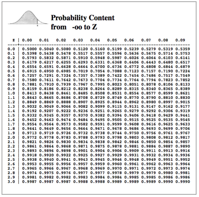
Practice using this table now! Make sure you are thoroughly familiar with how to use it and with what it represents! Here's a problem for you. In the standard normal distribution, the mean score is represented by 0. Thus, applying this table to our IQ-of-CCU-students example we did above, the value 118 is represented by 0 in this table. Furthermore, let's say the value 1.00 in this table represents the data value (or measured IQ) 133. (That is, a span of 15 IQ points is represented in this table as a span 1.00 on the z scale.) Assuming a normal model, approximately how many CCU students, of 9000, have IQs between 125 and 140? There are several steps necessary to find the solution, but think them through. It's not that hard if you're patient and systematic in your thinking. Hint: If z = 0 represents an IQ score of 118, and z = 1 represents 133, what z-score represents 125? That should get you started. Review of how to read this table if you need it. (And see the answer to the problem.) IV. Descriptive Statistics. After that brief sojourn into theory, let's get back to our actual data, or rather, Eysenck's actual data. Here's your task. Imagine this. There is a number line stretching all the way from one end of the universe to the other, all the way from negative infinity to positive infinity. 8 |
Somewhere along this infinitely vast number line is our little mound of data. You have to tell a friend (or statistics instructor, or worse yet graduate adviser!) where to find it, and you can give our friend only three pieces of information. How would you describe this little mound of data so that our friend could find it? The first thing you might want to tell our friend is how big the mound is. What is n? How many scores have been stacked up in this mound? Is our friend going to trip over it, or is she going to step on it without even noticing it! Okay, so n = 100, not an especially large mound, but respectable as data mounds go. Descriptive statistic number one is the sample size. Next, let's tell our friend approximately where the mound is located. To find the mound, look here. And to give our friend the best chance of seeing the mound, we'll tell her (roughly) where the middle of the mound is located on the number line. So, for descriptive statistic number two, we have to come up with a reasonable measure of location or measure of center for the data mound. The two most commonly used measures of center are the mean and the median. To find the mean, sum all the data values and divide by n, Mean = ΣX / n. This will give you a "typical" or "representative" score for the "typical subject." The mean is our elected representative for the data values; it is a typical data value from near the center of the distribution, the value that we think is most like all the other values in the distribution. As such, the mean must fall within the range of the scores. (A representative has to live in the district she represents.) Our scores range from a low of 3 to a high of 23. If you calculate the mean of those scores and get, say, 28.7, you've made an obvious mistake! It's not mathematically possible for the mean to be outside the range of the data values. In fact, usually it will be somewhere near the middle of that range. So if you had to guess, what value would you guess for the value of the mean? A reasonable guess would be 13, which is near the middle of values that range from 3 to 23. In fact, the answer is 11.61, so a guess of 13 wasn't far off. Good job! The median is the value that is in the middle of all the data values. Sort the data values in order from lowest to highest. The median is the value in the middle, with an equal number of data values below it as above it. (If there is an even number of data values, then there is no one value that falls in the middle. Find the two values that fall in the middle, and put the median midway between them.) For our data, given above, what is the median? We've already sorted the data (page 1), so the hard work is done already. All we need to do now is find the value that has half the data below it and half above it. There are 100 data values, so 50 of them will be below the median and 50 above it. In other words, the median will fall midway between the value that is in position 50 and the value that is in position 51. Once the data are sorted into order, finding the median is merely a matter of counting. Counting reveals that the value in position 50 of the sorted data is 10, and the value in position 51 of the sorted data is also 10. What value falls midway between 10 and 10? I'm gonna say 10. The median (Md) of our little mound of data is 10. Tell our friend to look for the data mound around 10 on the number line. We want our friend to find all the data values, not just some of them. So it might be a good idea to give her some notion of how spread out they are. Are the data values all clumped into a tight little mound? Or are they scattered for some distance up and down the number line so that our friend will have to look far and wide to find them all? Thus, descriptive statistic number three will be a measure of spread, also sometimes called a measure of dispersion, or a measure of variability. There are several good choices for this measure. We will be using three of them. 9 |
The easiest one to get is the interquartile range. Sounds hard--really isn't. The quartiles of a data set are markers that divide the sorted data into quarters, or four equal parts, just like the median divides it in half. In fact, the median is one of the quartiles, called the second quartile, or Q2. The lower quartile, or first quartile, called Q1, divides the lower half of the data in half again, thus cutting off the lowest quarter (25%) of the scores from the upper three-quarters (75%). The upper quartile, or third quartile, called Q3, divides the upper half of the data in half again, thus cutting off the highest quarter (25%) of the scores from the lower three-quarters (75%). This idea is shown in the following graphic. 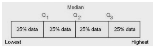
Now that you know (have been reminded) what quartiles are, you should be able to find them in our data. In the sorted data, find marker values that have 25 scores below and 75 above (we just happen to have 100 scores, so the percentages are easy) and 75 scores below and 25 above. Once again, it's just a matter of counting. Q1 falls in the midst of a bunch of sevens, so Q1 = 7. Q3 falls in the midst of a bunch of fifteens, so Q3 = 15. (Note: Deciles and percentiles are the same idea. Deciles divide the sorted data into ten equal parts, and percentiles into a hundred. Can you find the deciles in our data? Allow me to restate that question. Find the decile values in the Eysenck data. Click the Answer button to see the answer: ) Once you've counted out the values of Q1 and Q3, the interquartile range is just the distance between Q1 and Q3. That is, IQR = Q3 - Q1. In our data, that means IQR = 15 - 7 = 8. Think of the IQR as being sort of the like the range, the distance between the lowest and highest values, but it's the range of only the middle 50% of the data. The IQR is preferable to the range as a measure of spread, because the range is too sensitive to outliers, which are extreme values in the data. If the highest value in our data were (somehow) 230 instead of 23, then the range would be 227 instead of 20, and that would not really be representative of the data, 99% of it anyway. Generally, when you report the median as your measure of location, you should report the IQR as your measure of spread. The median and the IQR go together. And they both have the same disadvantage. They do not incorporate information about all the data values. We could go into the data and fool around with a good many of the data values (as we've already seen), without changing the values of the median or the IQR. The mean, on the other hand, as a measure of location incorporates information about all the values in the data, because we add them all together to get the mean. Change any one data value and the mean also changes. Can we come up with something like that as a measure of spread? Indeed we can! It's called the variance. Pay close attention to this! Having a thorough understanding of what the variance is and how it's calculated, and the terminology associated with it, will have a great deal to do with your success in statistics. The variance is based on the distance of the data values from their mean. The following graphic illustrates the basic idea. 10 |
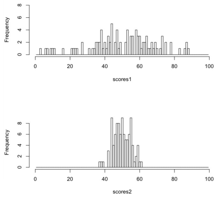
Two sets of n = 100 scores, scores1 and scores2, have been graphed in histograms. In both distributions the mean of the scores is 50. In scores1, however, some of the scores are as far as 47 from their mean (the minimum value of scores1 is 3, and 3 - 50 = -47, negative because 3 is in the negative direction from the mean). In scores2, the farthest score from its mean is at a distance of only 13 (the minimum value of scores2 is 37, and 37 - 50 = -13). Thus, scores1 are spread out, and scores2 are clumped together. Scores1 have a large variance, and scores2 have a smaller variance. The variance of scores1 is 363.3 (don't ask 363.3 what--it's just 363.3). The variance of scores2 is 25.4. How are those values calculated? I'm glad you asked! (Because you're going to need to know how to do this, and be able to do it without a formula sheet! If you understand what it is, you won't need a formula sheet. A formula sheet is a crutch for lack of real understanding.) The distance of a score from its mean is also called the score's deviation from the mean, or just deviation for short (sometimes deviation score). The first step in getting the variance is to calculate a deviation from the mean for every score in the data, X - Mean. (Click here for a .) A special property of deviation scores is that the full set of them will sum to zero. (Can you prove this?) That's because some of them are negative (scores below the mean) and some of them are positive (scores above the mean), and the negatives and positives just happen to cancel each other out. Always! Thus, the average or mean deviation isn't going to do us much good. The mean deviation score is zero. Always! 11 |
For the purposes of calculating the variance, we don't really care what direction the scores are from the mean, we just care how far they are. So we're going to get rid of the signs by squaring the deviation scores. Step 2: square all the deviation scores you calculated in step 1. Step 3: add the squared deviation scores to get the sum of the squared deviations, usually just called sum of squares for short. Thus, SS = Σ(X - Mean)2 for all X in the data. SS is an important statistic in its own right, which we will use quite a lot, so you need to commit it to memory right now. It is not a good measure of spread, however, because it's a sum. Therefore, just like the sum of the scores themselves, it just keeps getting bigger and bigger as you add more scores to the data. So part of what might make SS big is just that there are a lot of scores. To correct for this, we must do one final step, step 4, divide by n. This gives the mean squared deviation, also called the variance. (In some applications, the mean squared deviation score is called mean squares, something else you need to remember. Variance and mean squares, or MS, are the same thing.) If you remember that variance is the mean squared deviation around the mean, you won't need a formula sheet to know how to calculate it. There's a catch, however. When we calculate the mean as ΣX / n, we not only get a pretty good representative for the sample of scores, but we also get a very good (called unbiased amongst statisticians) estimation of the population mean. Remember, we're not terribly interested in the sample in its own right but only as a piece of the population. What we are really interested in is what is true about people, not just about these 100 people. Having an unbiased estimate of the population mean is good thing, therefore. Unfortunately, the variance calculated as above from a sample would not be an unbiased estimate of the population variance. It would be a bit too small. While Σ(X - Mean)2&nbps;/ n is the definition of the variance, it is not the way we usually calculate it from a sample. To get the sample variance, we divide by one less than n. It turns out, for reasons that would take some complicated mathematics to prove, that this is exactly the right correction to give us an unbiased estimate of the population variance. Thus, we define, and calculate, sample variance as: Σ(X - Mean)2 / (n - 1) = SS / (n - 1) Not sure which one to calculate? 999 times out of 1000 you're going to want the sample variance. Notice how prominently that formula is displayed. You should probably remember it! Further hint: n-1 is called degrees of freedom for this sample, so sample variance is SS/df. For our (Eysenck) data, the calculations would look like this. (I'll sort the data to make things easier to see.) Pick a few of the data values and follow along with a calculator. > sort(recall) # the recall scores sorted [1] 3 4 4 4 5 5 5 5 6 6 6 6 6 6 6 6 7 7 7 7 7 7 7 7 7 [26] 7 7 7 7 7 7 8 8 9 9 9 9 9 10 10 10 10 10 10 10 10 10 10 10 10 [51] 10 11 11 11 11 11 11 12 12 12 12 12 13 13 13 13 14 14 14 14 14 15 15 15 15 [76] 15 15 16 16 16 17 17 18 18 18 18 18 19 19 19 20 20 21 21 22 22 22 22 22 23 > sort(recall) - mean(recall) # deviations around the mean = 11.61 [1] -8.61 -7.61 -7.61 -7.61 -6.61 -6.61 -6.61 -6.61 -5.61 -5.61 -5.61 -5.61 [13] -5.61 -5.61 -5.61 -5.61 -4.61 -4.61 -4.61 -4.61 -4.61 -4.61 -4.61 -4.61 [25] -4.61 -4.61 -4.61 -4.61 -4.61 -4.61 -4.61 -3.61 -3.61 -2.61 -2.61 -2.61 [37] -2.61 -2.61 -1.61 -1.61 -1.61 -1.61 -1.61 -1.61 -1.61 -1.61 -1.61 -1.61 [49] -1.61 -1.61 -1.61 -0.61 -0.61 -0.61 -0.61 -0.61 -0.61 0.39 0.39 0.39 [61] 0.39 0.39 1.39 1.39 1.39 1.39 2.39 2.39 2.39 2.39 2.39 3.39 [73] 3.39 3.39 3.39 3.39 3.39 4.39 4.39 4.39 5.39 5.39 6.39 6.39 [85] 6.39 6.39 6.39 7.39 7.39 7.39 8.39 8.39 9.39 9.39 10.39 10.39 [97] 10.39 10.39 10.39 11.39 12 |
> sort(recall - mean(recall))^2   # squared deviation scores
  [1]  74.1321  57.9121  57.9121  57.9121  43.6921  43.6921  43.6921  43.6921
  [9]  31.4721  31.4721  31.4721  31.4721  31.4721  31.4721  31.4721  31.4721
 [17]  21.2521  21.2521  21.2521  21.2521  21.2521  21.2521  21.2521  21.2521
 [25]  21.2521  21.2521  21.2521  21.2521  21.2521  21.2521  21.2521  13.0321
 [33]  13.0321   6.8121   6.8121   6.8121   6.8121   6.8121   2.5921   2.5921
 [41]   2.5921   2.5921   2.5921   2.5921   2.5921   2.5921   2.5921   2.5921
 [49]   2.5921   2.5921   2.5921   0.3721   0.3721   0.3721   0.3721   0.3721
 [57]   0.3721   0.1521   0.1521   0.1521   0.1521   0.1521   1.9321   1.9321
 [65]   1.9321   1.9321   5.7121   5.7121   5.7121   5.7121   5.7121  11.4921
 [73]  11.4921  11.4921  11.4921  11.4921  11.4921  19.2721  19.2721  19.2721
 [81]  29.0521  29.0521  40.8321  40.8321  40.8321  40.8321  40.8321  54.6121
 [89]  54.6121  54.6121  70.3921  70.3921  88.1721  88.1721 107.9521 107.9521
 [97] 107.9521 107.9521 107.9521 129.7321

> sum(sort(recall-mean(recall))^2)   # the sum of the squared deviations, or SS
[1] 2665.79

> sum(sort(recall-mean(recall))^2) / 99   # SS/(n-1), the sample variance
[1] 26.92717
Obviously I did that with a computer. You will, too, eventually. If you're thinking, "Wow! That looked hard!" Consider this. > var(recall) [1] 26.92717 Feel better now? As valuable as it is as a statistic, and we will use it often in our calculations, there's a problem with the variance, which is that it is the "average" of squared values. Whatever the units of the original measurement were, the variance is in those units squared. If the variance is a typical squared deviation score, how can we get a typical deviation score in the original units of measurement? Obviously, we take the square root of the variance. That gives us our third measure of spread, the root mean squared deviation, also called the standard deviation. In this case, since it is being calculated from a sample with that (n-1) trick, it is called the sample standard deviation. It's value is sqrt(26.92717) = 5.18914. Think of the standard deviation as a typical deviation score. It is the typical amount by which scores deviate from their mean. (Yes, you need to remember that! It's on the test!) If you report the mean as your measure of location or center, you should report the standard deviation as your measure of spread or variability. The mean and the standard deviation go together. It has been a long way through this discussion of measures of variability, and that is entirely appropriate. As psychologists, our business is explaining variability. Why are people different? Why aren't we all the same? Why do people have different IQ scores? Different preferences for friends? Different views on political issues? Why are some people schizophrenic while others are not? Why do we react differently to sights, sounds, odors, and tastes? Why can't some people differentiate between red and green while others can? Why are some people introverted and others extraverted? And so on. It's all about variability! The obvious first step in understanding is finding a way to quantify variability, and now we have several good ways. To summarize, and tidy a few things up, we now have two ways to summarize a set of data, a five-number summary, and a three-number summary. Wait, what? Five? Okay, the five-number summary consists of the median, the quartiles Q1 and Q3, and the minimum and maximum values. And we'd also want to report n, which in reality makes that a six-number summary. Sorry about that, but I didn't invent the name. Sometimes, Q1 and Q3 are combined (by subtraction) to give the IQR. The three-number summary consists of the mean, the standard deviation (or variance), and n. So right now, give a compact summary of the Eysenck data using both of these methods (i.e., two summaries). Click the check buttons to check your answers.
13 | ||||||||||||||||||||
V. The Shape of Things. And by "things" I mean distributions of data. It might also help to know a little about how our mound, or distribution, of data is shaped. Here are just a few of many possibilities. 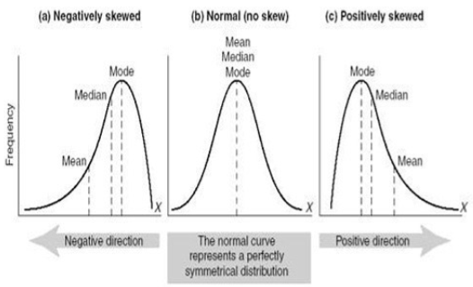
The normal distribution is in the middle of this trio. The normal distribution is mound-shaped, but even more, it is symmetrical right and left. That is, you could fold it along the dotted line in the middle, and the bottom half would fold right over the top half, exactly. The peak of the mound, called the mode, is right in the middle, and so are the mean and the median. In the normal distribution, and in all symmetrical mound-shaped distributions (the normal is not the only one), the mean and the median really are at the center. To the left is a distribution in which the mound has been pushed off to one side in such a way that the lower tail of the distribution is longer than the upper tail, which hardly exists at all in this illustration. This is a skewed distribution, and in particular, it is a negatively skewed distribution, sometimes also said to be skewed to the left. Notice that the mean, median, and mode no longer have the same value. The mode is still at the peak of the mound (by definition), but the median has been pulled a bit into the longer tail. The median still splits the distribution in half (by definition). That is, it is still true that 50% of the scores are below the median and 50% above. So the median can still be regarded as "the center" of the distribution in this sense. The mean, on the other hand, has been pulled farther into the tail. This is a disadvantage of the mean. If the distribution is symmetrical or nearly so, the mean works well as a measure of center. If the distribution is strongly skewed, or if there are outliers off one tail, then the mean will be strongly influenced by that and "pulled" in the direction of these extreme scores. When dealing with strongly skewed distributions, or ones in which there are outliers, it is often worthwhile to consider abandoning the mean as a measure of center. The figure on the right represents a positively skewed distribution, or a distribution that is skewed to the right (because the tail points that way). Once again, notice how the mean has been pulled into the tail. Skewed distributions often present a problem for statistical analyses that are based on the mean. We'll have to learn how to deal with that. 14 |
Skewed distributions occur frequently in real-world data. Notice that Eysenck's recall scores are positively skewed. And notice, too, that this positive skew resulted in the mean (11.61) having a larger value than the median (10), which is an important giveaway that you might be dealing with a positively skewed distribution. It's the opposite in a negatively skewed distribution, where the mean is less than the median. These are good rules to remember. Skewness pulls the mean into the tail more so than it does the median. Compared to other distribution problems we might be faced with, skewness is relatively easy to deal with statistically, however. Consider the following distribution of observed waiting times between eruptions of the Old Faithful geyser in Yellowstone National Park. 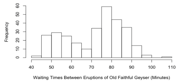
Here is a distribution that appears to be composed of two overlapping mounds of data. Such a distribution is said to be bimodal (it has two modes). Bimodal distributions can bring further statistical analysis to a screeching halt while we figure out what the heck is going on with these data. On the other hand, bimodality is often more than just a nuisance. Often it's trying to tell a story. I.e., there is a reason for it. When you see bimodality, it's your job as a statistician to stop and ask why. VI. Inference Based On the Normal Model, Part 1: Describing Groups. Here's something I haven't told you yet about Eysenck's recall scores. Half of them came from college-aged subjects, and half of them came from older subjects, in their 50's and 60's. Here's how the scores break down by age. > eys$Recall[eys$Age=="Younger"] [1] 7 9 7 7 5 7 7 5 4 7 6 10 6 8 10 7 7 9 9 4 14 22 18 13 15 [26] 17 10 12 12 15 15 16 14 20 17 18 15 20 19 22 18 21 21 18 16 22 22 22 18 15 > eys$Recall[eys$Age=="Older"] [1] 6 10 7 9 6 7 6 9 4 6 6 6 10 8 10 3 5 7 7 7 10 7 14 7 13 [26] 11 13 11 13 11 23 19 10 12 11 10 16 12 10 11 10 14 5 11 12 19 15 14 10 10 Okay, time to grab your calculator and get to work. I want a complete summary for both of these groups. As we are about to do inference based on a normal model, the three-number summary would be most appropriate. But it wouldn't hurt you at all, I'm sure, to practice getting the five-number summary, too.
I'll help you out a bit with the five-number summary, because there is a very common and revealing way to graph it, called boxplots. These graphs are on the next page, in this case called side-by-side boxplots, and they very quickly, at a glance, reveal some interesting differences between the two groups. In a boxplot, the heavy bar near the middle of the box represents the median. We can see now that the median recall score of the younger subjects was higher than that of the older subjects. The box spans the distance from Q1, the lower limit of the box, to Q3, the upper limit of the box. (What is this distance called? ). Q1 is the same in both groups, but Q3 is quite a bit higher in the group of younger subjects. In fact, the median score for the younger subjects is higher than Q3 for the older subjects. 15 |
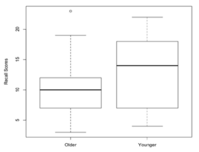
The lines that extend out from the box and end in a cross-bar are called whiskers. Which is why these kinds of graphs are sometimes called box-and-whisker plots. The whiskers extend to the minimum score on the bottom and the maximum score on the top, unless there are outliers, which are then plotted as individual points off the end of the whisker. Notice the outlier in the "Older" group, which is the score of an older subject who did better than any of the younger subjects. With the exception of this one outlier, however, it appears the younger subjects generally did better than the older subjects at this task. Boxplots are increasingly the graphic of choice for comparing groups. We will be using them a lot. You need to know how they work. Here is a graphical summary of what I just wrote. Make sure you get this! For example, why is the top of the box labeled 75th percentile rather than Q3? Yes, they are the same. But why? How are the outliers defined? What is the maximum length of a whisker? 
16 |
Here is another interesting graphic ("borrowed" from Wikipedia) that shows how a boxplot breaks down scores that are normally distributed. Compare that to the breakdown in the bottom normal curve in which scores are broken into ranges by standard deviations (σ). Here's something to remember. In a boxplot, the box always spans 50% of the scores, even if the distribution is not normal or symmetrical. If the distribution is not normal, however, the mean plus and minus one standard deviation will not span 68.27% of the scores. One more thing to remember: in normally distributed data (only!), the whiskers of a boxplot span 99.3% of the scores (approximately 99%), so there will be "outliers" if the sample is large enough. (Why?) "Outliers" on a boxplot are not necessarily suspicious or unexpected. 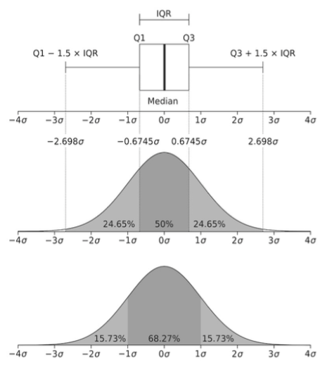
Let's get back to our normal model. But wait, I hear you protest. Eysenck's scores are positively skewed. How can we justify a normal model? If you were asking that question, good for you! You are paying attention! And if you weren't asking that question, well, what can I say? Get used to looking for things like that! It turns out the normal model is justified here, but you'll have to wait awhile for the explanation. 17 |
Answer the following questions from the Eysenck data. 1) Are the two groups the same size? If so, then this is called a balanced design. More on the importance of that later. 2) Which group has the larger mean? How do you interpret this? I.e., did they "do better?" Larger scores do not always mean better. Can you give an example of when they might not? Always think about what your scores mean. Don't just assume bigger is better. 3) How different are the groups? I.e., what is the difference, or distance, between the means? In what units? 4) How does this difference compare to the size of the standard deviation? (The two standard deviations are not the same, so for now, use a rough average of the two to answer this question, which has a value of about 5.0.) To answer this question, fill in this blank: The distance between the means is _______% of the size of the (average) standard deviation. 5) Is this a justifiable calculation? I.e., is the difference between the means and the average size of the standard deviation in the same units? (We wouldn't want to go dividing apples by oranges, now, would we?) VII. Inference Based On the Normal Model, Part 2: Justification of the Normal Model. Let's look for now only at the younger subjects, and let's assume that these subjects were a random (or at the very least, representative) sample of young people. They probably were not. They probably were all college students, which makes what we are about to do a bit suspect, but they are probably a representative sample of some population. For the younger subjects, the mean number of words correctly recalled was 13.16 with a sample standard deviation of 5.7865 (rounding a bit). The sample size was 50 (exactly). Compare these values to the results you filled into the table. At this point, what is our best guess (estimation) of the value of the mean in the population that was being sampled? As this sample is the only information we have about that population, we can't do any better than to say, "We estimate the population mean to be 13.16 words recalled." We use the sample mean as an estimate of the population mean, because we have nothing better. This is called a point estimate, because on the number line we are singling out one point and using it as the estimate. Our estimate is probably wrong. In fact, it's almost certainly wrong. Samples rarely if ever represent populations perfectly. (Samples are what? ) It would be nice to know "how wrong" the estimate might be. Well, surprise! We have a statistic for that! It's called the standard error of the mean. Recall that statistics are numbers derived from samples. All statistics have standard errors that tell how accurate they are as estimates of the same value in the population (the population parameter). Because, after all, we don't care that much about the sample. We want to know what's true about young people, not just these 50 particular young people. It's calculated as follows: (estimated--not important why) s.e.m. = sample standard deviation divided by the square root of the sample size. I can't give you a good explanation of why that's true without doing some mathematics, so unlike the mean and standard deviation, which you should be able to remember how to calculate because they make sense to you, you're just going to have to memorize how to calculate the standard error of the mean. In this formula, s is the standard deviation, and n is the sample size. So what is s2 then? Make sure you understand why the two versions of this equation are equivalent. (And it's estimated sem because s is only an estimation of σ, the population standard deviation. In case it ever comes up!) 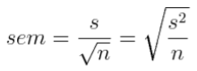
18 |
Standard error represents error in the sample statistic only under certain conditions. In the case of the standard error of the mean, those conditions are essentially the ones that hold under the normal model. So when is the normal model justified? The normal model means we assume we are sampling from a normally distributed population, so if we are, fine! If we're not, then technically the normal model is wrong. "Wrong" doesn't necessarily mean "not useful," however. It turns out that the normal model is adequate (i.e., approximately accurate, or close enough) when the sample size is large enough, even if we are not sampling from a normal distribution. How big does the sample have to be? That depends on how much the population distribution differs from normality. Even in really bad cases, however, a sample size of 30 or more is usually adequate to allow the use of the normal model as a very reasonable approximation. Have we met that criterion? What is our sample size for this group of younger subjects? (Why is it true that the normal model is adequate with reasonably large sample sizes? They probably explained that to you back in your first stat course, but if you don't remember, then you're just going to have to take my word for it. It has to do with the shape of the sampling distribution of the mean. Ask me if you want a further explanation of that!) Above, we used the sample mean as a point estimate of the population mean. Remember? That's what got us into this discussion! And we decided it's probably not a perfectly accurate representation of the population mean, hence the word "estimate." Under the normal model, it is probably true that the sample mean is within one standard error of the population mean, however. Turning this statement on its head, we can also say that the true population mean is probably within one standard error of the sample value. Probably? Okay, we can be about 68% sure of it. Meaning if we took sample after sample after sample after sample from this population, about 68% of the time we'd get a sample mean that is within one standard error of the true population mean. Provided the samples were random. VIII. Inference Based On the Normal Model, Part 3: Issues of Sampling. 68% of the time, huh? Provided...? Provided the normal model is adequate. And...? And we have done our sampling correctly. Provided we have taken a random sample. And not just any random sample. Not a stratified random sample. Not a sample of random clusters--cluster sampling. A true random sample, in which every person in the population has an equally likely chance of being included, and the inclusion of one person, say Fred, is in no way related to (probabilistically speaking) the inclusion of any other person, say Joe. We, no doubt, have a sample of college students who volunteered to spend an afternoon taking part in Dr. Eysenck's study, and I'll go even further and say probably because they had to in order to meet a course requirement in general psychology. Is this a random sample? In no way, shape, or form is this a random sample! Is it a representative sample of young people? I doubt it! Ah, but it's a large sample, so good enough, right? No, sorry! If the sample is biased (i.e., nonrandom), then making it large doesn't help. So should we stop right now and all go take a course in basket weaving? Perhaps! How are we justified in continuing at this point? If our interest were in only one group, young people, and we were interested in finding some characteristic of young people in general, then we would not be justified in continuing! It would be like trying to find out how people are going to vote in the next election, and drawing our sample of people to be polled only from upper class neighborhoods. We can all see the problem there, I think. Our real interest here is in comparing two groups, younger people and older people. We almost surely do not have a random sample of either. So when we're done, we're going to have to be very careful about saying these results apply to a larger population, a process called generalization. No random samples, no valid generalization. Period! We might speculate that the results generalize, and if others have done similar experiments with samples drawn from other sources--replication--and have found the same thing, then we become more confident in our generalization. But the fact remains, without a random sample, or at the very least a sample we can assume is representative, generalization goes out the window! 19 |
IX. Inference Based On the Normal Model, Part 4: Relationships Between Variables. There is something else we might be interested in, however, and that is finding a cause-and-effect relationship between variables. In the Eysenck study, as it has been described so far, there are two variables. Variables are things that can change. Okay, so almost everything can change, but let's not get carried away. Let's restrict ourselves to discussing things about our subjects concerning which we have recorded information. Let's look at one subject, Fred. What have we recorded about Fred? If we want to compare younger subjects to older subjects, it would be necessary to know which one Fred is, so presumably that is one thing we've recorded about Fred. The other thing we've recorded, of course, is Fred's recall score. Now let's look at another subject, Joe. We have recorded the same two things about Joe. Might those things be different in Joe's case from what they were in Fred's case? Sure! There you have it, variables in a nutshell. If we have recorded two (or more) instances of, say, recall scores, and there is a chance those two instances might have different values, there you have it--a variable. Now it's highly likely that we've recorded other things about Fred and Joe. For example, we might have made a note of their gender, their race, their native language, their height and weight (for some reason), their... Well, you get the picture. And all of these things can be variables. At the moment, are we interested in any of those other things? NO! We're interested in seeing if there is a relationship between TWO THINGS: age and recall score. Let's keep our thinking clear on this issue. Screw gender and race and all that other crap! TWO THINGS: age and recall score. We want to know how age affects recall. If it does. (In stat, affect is a verb, effect is a noun. Don't mix them up! "Affect" is something a variable does to another variable. "Effect" is something a variable has. I.e., if age affects recall, the age has an effect of recall.) The lesson here is MAKE SURE YOU KNOW WHAT THE VARIABLES OF INTEREST ARE. And then forget, for the time being, about all that other stuff. Discipline your thinking now. If you can't do this, you are doomed from the outset in statistics! Now we're going to fudge a bit. This is a class in Intermediate statistics. We're not going to be covering advanced techniques, like log-linear analysis or discriminate analysis or factor analysis. We're going to be talking about relatively simple procedures like t-tests and ANOVA and regression analysis. Question number one: Are there groups? Do we have a variable of interest that defines groups? If so, then in an elementary statistics class, 998 times out of 1000, that will be the independent variable. The independent variable (IV) is the one intentionally created by the experimenter. The IV is the variable we are interested in seeing the effect of and, therefore, is the one that creates the groups. Eysenck intentionally recruited subjects who fell into two different age groups. Some of those subjects were younger, and some were older. We want to know how age affects recall. So age is the IV. By the way, a variable that defines groups is called a grouping variable, a nominal variable, a qualitative variable, and a categorical variable. Those are all important names and you need to remember them. Make a note! Another name for a grouping variable is factor, but we'll save that one for later. Also by the way, we won't always have groups, so eventually things will get more confusing, but don't worry about that now. For now, we have groups. 20 |
Question number two: Now that we've defined our groups, what is it that we want to know about them? In what way do we suspect these groups differ? That is the dependent variable (DV). The experimenter knows about the DV, of course, but she does not create the values of the DV. She does not define them or determine what values the DV will have. Once the groups are created, the values of the DV will be measured by the experimenter. We want to know how those values are related, if they are, to the IV. We want to know how age affects recall. So recall is the DV. Usually, but not always, the value of the DV will be a number. Okay Fred, you old buzzard, what number are you going to give me as a value of the DV? Variables that have numbers as values are called interval or ratio variables, quantitative variables, and numeric variables. Sometimes grouping variables are coded with numbers, like 0 and 1, but that does not make them numeric. Those codes are just alternative category names. The value of a numeric variable comes from measurement with an instrument such as a stopwatch, a calendar (in the case of age), a ruler, a scale, a pH meter, or a psychological test. Another trick you need to be aware of: notice our IV is age, and we are calling it categorical. Why is that? Age is a number. Yes, but we have grouped people by age. We have categorized them as being younger or older. Therefore, for us, age is categorical. You need to keep track of all this. These are absolutely fundamental skills for being able to do statistics. If you cannot identify your variables, if you cannot determine which is the IV and which is the DV, if you cannot determine whether a variable is categorical or numeric, well, basket weaving awaits, because you are absolutely sunk in statistics! No kidding! Okay, back to relationships between variables. This is what we're looking for. While it's nice, and occasionally useful, to see how one thing IS, it is much more useful and interesting to see how two or more things are related. For example, it's not especially useful to know that people can on the average recall 12 words from an arbitrarily conceived list of 30 words that they have seen in an arbitrary format for an arbitrary length of time. It could be very useful, and is certainly interesting, to know that older people do not do as well on this task as do younger people. That is, it's interesting to see that there is a relationship between age and recall. Ability to memorize and recall words is related to age, or so it appears from what we've seen so far of Eysenck's results. A relationship between variables exists if it's possible to guess the value of one variable somewhat more accurately if you know the value of the other variable. Here's Jill. Guess how many words she recalled? I don't know! Twelve? (Guessing the overall mean.) If you tell me how old Jill is, perhaps I can make a more accurate guess. If I can, then there is a relationship between age and recall. (We will see another way to define a relationship eventually, but this way is perfectly fine.) On the other hand, here's Jill. What's her IQ? I'll tell you that Jill is a 55-year-old woman. Does that help? It does not. There is no relationship between IQ and age or gender. Other words also imply relationship. Another word for relationship is association. Recall is associated with age (we think). IQ is not associated with age. When a relationship exists between two numeric variables, we call that relationship a correlation. It is not appropriate to call a relationship between a numeric and a categorical variable a correlation. (It is under certain circumstances, but we will have to talk about that later.) So if we find there is a relationship between recall scores and whether the subject is younger or older, avoid calling that a correlation. It is also not appropriate to call a relationship between two categorical variables a correlation. 21 |
Another word that is frequently used in this context is effect, but the word effect has to be used with care as well. Statistically, effect and relationship mean about the same thing. If there is a difference in recall between younger and older subjects, then we say there is an effect of age on recall. However, to some people, using the word effect would imply a cause-and-effect relationship, and the existence of a statistical effect implies no such thing! When can say that one thing causes another? When does A cause B? This is something philosophers like to argue about, and it is important for scientists to get this right, but I'm not a philosopher, and this is not a philosophy class, so I'll give you a simple version. If B occurs after, and only after, the occurrence of A, then we would say that A is a necessary condition for B. If A, and only A, needs to occur to get B, then we would say that A is a sufficient condition for B. If A is both necessary and sufficient for B, then clearly A causes B. If B always occurs after A occurs, then A is a sufficient condition for B and may be a cause of B. It may not be the only cause, however. If B only occurs after A occurs, but sometimes doesn't occur after A occurs, then A is necessary for B, but not sufficient, and may be part of the cause of B. Here's an experiment. People who take Valium become less anxious. The same is true of cats, and this experiment was done on cats, but we'll talk about it as if it had been done with people. Taking Valium is usually sufficient to reduce anxiety. But it's not necessary. Other things, including other drugs, can reduce anxiety as well. So does taking Valium cause a reduction in anxiety? I would say so, but cause- and-effect is a tricky business. In the experiment I want to discuss, the researchers believed that just taking Valium is neither necessary nor sufficient to reduce anxiety. In order to reduce anxiety, the ingested Valium must reach a specific area of the brain called the amygdala. Valium acts in widespread areas of the brain, but if it can't get to the amygdala, it won't alleviate anxiety, or so these researcher hypothesized. So here's what they did. First, they injected Valium directly into the amygdala in some of their subjects. In other subjects, randomly chosen, they injected an inert placebo. (What is the IV? What is the DV?) The subjects who got the Valium had reduced anxiety, while the subjects who got the inert placebo did not. Apparently, having Valium injected directly into a healthy and properly functioning amygdala is sufficient for anxiety reduction. It does not have to go to any of those other areas of the brain. Getting Valium to the amygdala is enough. Valium works by binding to certain receptors in the brain. So what the researchers did next was to inject another drug into the amygdala that blocks those receptors. It goes to the receptors, grabs hold of them, and does not let anything else get to them. (A bit of an oversimplification, but okay for our purposes.) Then they gave these subjects Valium systemically, the way we usually get it. These subjects did not experience anxiety reduction. So it appears to be necessary for Valium to get to the amygdala in order to have it reduce anxiety. Having it get to any other area of the brain or body is not enough. It has to get to the receptors in the amygdala. Bottom line: Valium has to get to the amygdala, and only to the amygdala (although it can go elsewhere as well), to reduce anxiety. Getting to the amygdala is both sufficient (the first experiment) and necessary (the second experiment) for Valium to reduce anxiety. Valium causes a reduction in anxiety, and it does so by acting in the amygdala of the brain. Good experiment! 22 |
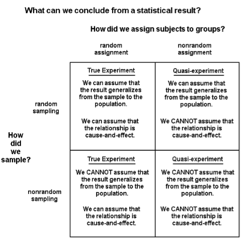
Let's simplify it. We have 20 people with varying degrees of anxiety, which we have measured with some sort of anxiety measuring device (probably a psychological test). We give 10 of these people Valium, and 10 of them get nothing. The people who get the Valium experience a reduction in anxiety. Based on these results, can we say that Valium causes a reduction in anxiety? No. Why? Okay, let's fix our little "experiment." We give 10 of the people Valium, and we give the other 10 an inert placebo pill that looks exactly like Valium, and we don't tell them whether they're getting the Valium or the placebo. The people who get the Valium experience a reduction in anxiety. Based on these results, can we say that Valium causes a reduction in anxiety? No. Why? Okay, let's fix it up a little more. We randomly decide who we're going to give the Valium to by flipping a coin. If the coin lands heads up, the person gets Valium. If it lands tails up, the person gets the inert placebo. Once again, we don't tell them who is getting what. The people who get the Valium experience a reduction in anxiety, while the placebo people do not. Based on these results, can we say that Valium causes a reduction in anxiety? Yes. Statistically, we can now say that we have a cause-and-effect relationship. What was the critical difference? The random assignment to conditions of the experiment is what was necessary before a statistician is willing to utter the words "cause and effect." We're a little less strict in statistics about concluding we have a cause-and-effect relationship than are scientists in general, but we're still pretty strict. Before we can say a relationship is cause-and-effect, it must be seen in an experiment in which the subjects were randomly assigned to the treatment conditions. We must have random assignment. In fact, without random assignment, we shouldn't even say we have an experiment. Without random assignment, we have a quasi-experiment. If random assignment exists, then we have a randomized experiment, a designed experiment, or a true experiment. Which situation do we have in Eysenck's study of age and recall? And when all is said and done, will we be able to conclude that being old causes a reduction in recall of words from a list? On the next page is a table that summarizes much of what we've learned in the last two sections. Now here's a harder question. We've seen a difference in recall scores, on average, between younger and older subjects. Is the difference due to the age of the subjects, or is it due to some other difference that exists between the two groups? Is there another difference between the two groups? I can think of one. It's likely that the younger subjects were all college students. It's unlikely that the older subjects were college students. Thus, we are not only testing young against old, we are also testing college against non-college. We're not interested in that, but there it is nevertheless. That's the problem with quasi-experiments. There may be a third variable, or several "third variables," that also constitutes a difference between our groups, that may account for our results. Such a third variable is called a confounding variable, or a confound for short. In randomized designs, we like to think that such confounding third variables have been randomized away, and so in true experimental designs we can be much more confident that the IV is actually the cause of any difference in the DV between the groups. In quasi-experiments we cannot be at all confident of that. The potential for confounding is great. In fact, in quasi-experiments, just count on confounding being present. I'll go further. You should not only count on it, you should make a concerted effort to find and list those confounds. That's part of your job as a statistician. 23 |
X. Inference Based On the Normal Model, Part 5: Confidence Intervals. By now you should be aware that statistics is not just punching numbers into a calculator and key-pecking out the answer. A pigeon could be taught to do that! That is a very small part of statistics. By far the larger and more important part of statistics is conceptual and deals with these issues of sampling, generalization, nature of effect, confounding, and others that haven't yet been mentioned. Above all, statistics involves thinking clearly about these issues, something a pigeon (I assume) cannot do. A good grade in statistics should involve doing things of which a pigeon is incapable! A few pages ago, I said under the normal model, with random sampling, about 68% of the time we will get a sample mean that is within one standard error of the population mean. Let's assume the normal model holds here, and that our sampling was good enough to get us at least a representative sample of some population. There were 50 younger subjects, with a mean recall score of 13.16 words, and a standard deviation of 5.79 words. Quick! Get me an estimated standard error of the mean. sd / sqrt(n) = 5.79 / sqrt(50) = Thus, under the normal model, we can be reasonably certain that the population mean falls between 13.16 - 0.82 and 13.16 + 0.82, or between 12.34 and 13.98. This interval is called a confidence interval, and be aware that we have fudged just a little in calculating it to keep things simple, but it is a very reasonable approximation to the "correct" answer. 24 |
It is more common to calculate the confidence interval as follows. The upper and lower bounds on the confidence interval are called the confidence limits. We are going to use a convenient approximation that works well as long as the sample is reasonably large, say 30 or more, which holds here, and that is to use 2 as a multiplier of the standard error. (You probably remember that the true multiplier is obtained from a t-table. In this instance, with n=50, the correct multiplier would be 2.01.) The result of this calculation is a 95% confidence interval. Using this method, we get (get them for yourself!) a lower confidence limit of 11.52, and an upper confidence limit of 14.80. (Done without the approximation, the answers would be 11.51 and 14.81.) We say that we are 95% confident that the true population mean for recall scores of younger subjects lies between 11.52 and 14.80. Previously, we estimated the population mean by using the sample mean of 13.16, a point estimate. The point estimate, we agreed, was almost surely wrong, but given the information we have, if we insist on a single value as the estimate, then that's as good as we can do. Now we have an interval estimate of the population mean, and it's not one specific value, but we can specify how confident we are that the real value of the population mean falls in that interval. So which do you prefer? A single number that's surely wrong, or an interval that has a high likelihood of containing the right answer? Let's do the same for the older subjects. Their mean recall score was 10.06 words, with a standard deviation of 4.00 words, and once again, n = 50. So the standard error of the mean is (calculate it!) 0.566, or rounding a little more, 0.57. Thus, the upper and lower confidence limits for a 95% confidence interval are 8.93 and 11.21. Those are the same answers you got, right? (Once again, off by 1/100 th from the "correct" values of 8.92 and 11.20, so I'd say our convenient approximation is a good one!) I'm sure you've noticed that the 95% CI for the younger subjects and the 95% CI for the older subjects do not overlap. XI. Inference Based On the Normal Model, Part 6: Differences Between Groups. The younger group and the older group had different recall scores, on average, in the sample. There's no question about that. We can see it in the data summary. The question is, why? There are three things that can create differences between groups: 1) It could be a "real" difference, i.e., a difference created by the IV. 2) It could be a difference that's being created by a confound, i.e., not a difference due to the IV but due to some other way in which the groups differ that we have not controlled for. 3) It could be random error, or what I sometimes refer to as noise or dumb luck. Random error means the difference isn't "real," but was created because we got unlucky in our sampling, and by dumb luck managed to select, in this case, older subjects with lower scores and younger subjects with higher scores. On the average, however, in the real world (the "population") this difference doesn't exist. Random error does not mean anyone has done anything wrong. The sampling procedure may have been done perfectly. We just got unlucky. Random error can be simulated by writing each of the 100 scores on little slips of paper, or blocks of wood if you have them, and putting those in a hat, mixing them thoroughly, and then randomly drawing out 50 to represent the younger subjects and 50 to represent the older subjects. I had my computer do this. I got group means of 10.64 and 12.58, almost 2 points different. That's not as different as the obtained result in the experiment, but it's still a substantial difference, and there is no explanation for it other than dumb luck, i.e., random error. 25 |
In fact, I had my computer do this rerandomization 1000 times and calculate the difference between the means each time. The result appears in the frequency histogram below. 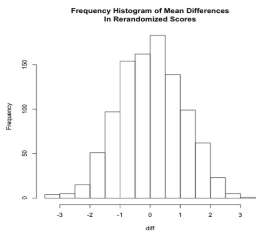
Look at this histogram carefully. What do you see? These are difference produced just by random chance between the two groups. What do you notice? Before you read on to the next page, make a list of what you see in the boxes below. You may not use all these boxes. I didn't. But I used most of them. 1) 2) 3) 4) 5) 6) 7) 26 |
As you can see from the histogram, 1) most of the rerandomizations resulted in very small differences between the means, as would be expected. 2) Many of the differences were within 0.5 of zero. But they were still differences. In fact, none of the mean differences was exactly zero. Fifty percent of them were between -0.74 and +0.78. Only 25% were lower than -0.74 and 25% higher than +0.78. (What are these cutoffs called? What is this range called? If you can't answer this, back to page 1 with you!) 3) Differences as large as 3 were rare. The largest difference, positive or negative, was 3.30. 4) Although there are very few of them, there are differences as large or larger than 3. 5) The differences appear to resemble a normal distribution. The actual difference obtained in the experiment was 3.10. In 1000 tries, I got a difference this large or larger (positive or negative) only five times by rerandomization. What can we conclude from this? One thing we can clearly conclude is that it's possible to get the difference we saw in the experiment just by dumb luck, or random error. So that obtained difference may not be "real." Another thing we can conclude is that a difference of 3.10 or larger (positive or negative) is not very easy to get by rerandomization of the data. It occurred only 1/2 of 1% of the time. If these data truly represent the population ("real world"), then we would have to conclude that it is very unlikely that random error could produce a difference as large as the one we saw. Now I can see the question practically poking out of your forehead! Is it possible to get a confidence interval for the mean difference? Sure it is! The mean difference is a number calculated from the sample, a statistic, and it therefore has a standard error. First, get the pooled standard deviation, which is calculated this way in the case of two groups. (A general formula is given in the appendix to this review.) By the way, pooled kinda means average. 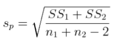
In section VI above we estimated this value to be 5.0. In fact, it is... I'm sure--absolutely positive--that you've already whipped out your calculator and have calculated it for yourself. If you haven't, well, there is always that course in basket weaving! Statistics is not a spectator sport!! The correct value for the pooled standard deviation for these groups is 4.98. Second, take the pooled standard deviation and multiply by the square root of 2/n, where n is the common group size. (In other words, this method will work only for balanced designs.) It's almost possible to do this one in your head! The answer comes out to be 0.996, or very nearly 1.00. This number is called the standard error of the difference between the means. Third, we use the same method to get the 95% CI. In words, the confidence limits for an approximate 95% CI can be calculated by adding and subtracting two times the standard error to the sample statistic. In this case, the sample statistic is the obtained difference between the means, which is 3.10. (In this case, the "correct" multiplier is 1.984, so once again, multiplying by 2 gives us a reasonably accurate approximation, and usually will with large samples.) So here is a quick in-your-head calculation, which is surprisingly accurate in this case. UL = 3.10 + 2 * 1 = 5.10 LL = 3.10 - 2 * 1 = 3.10 We can now see that an approximate 95% CI for the difference between the means runs from 1.10 to 5.10 ("correct" answer without approximations: 1.125 to 5.075). That is to say, we can be 95% confident that the difference between these group means in the population is somewhere between 1.1 and 5.1. Notice that this interval does not include zero. So in effect, what we've just said is, we are 95% confident that these two groups are really different in the population. The difference is probably not due to random error. (Have we ruled out the possibility of a confound creating this difference? Can we now attribute it confidently to the IV? ) 27 |
XII. Inference Based On the Normal Model, Part 7: Hypothesis Testing. We are nearing the end of this review, I'm sure you'll be absolutely delighted to hear! I bet you didn't realize you learned so much in your first stat course. What we've done above is really all we need to conclude that the difference between these two sample means is probably not due to random error, but in your first stat course you were no doubt taught a more formal method called hypothesis testing or significance testing. It involved these steps.
The null hypothesis is usually the hypothesis of no difference between (or among, in the case of more than two) groups. The null hypothesis doesn't have to say "no difference," but it does have to make a precise mathematical prediction, which will be the basis for our calculations. The alternative hypothesis, which is our experimental hypothesis, the one we will write about in our experimental report, usually says there is a difference between the groups in the population. For Eysensk's study, the null hypothesis will say that there is no difference between younger people and older people in their ability to recall words from a list. The alternative hypothesis will simply negate this and say there is such a difference. Notice that hypotheses are stated in the present tense, because they are about the population, and what is true in the population is true now (we hope). Establishing a decision criterion means, at the very least, stating an alpha level. We'll discuss more formally what the alpha level actually is in the next section, but for now just be aware that, in absence of a good reason to do otherwise, the alpha level is usually set at α = .05. The alpha level goes along with specifying critical values for the test statistic, establishing rejection regions, and other such stuff. We'll put off a more formal discussion of this for the time being as well. Only now, once the previous two steps have been done, do we go out and collect the data. (Okay, so we fudged a bit here!) Once the data are collected, we summarize them statistically, and then we use our summary (descriptive) statistics to calculate a test statistic. In this case, the test statistic will be a t-value, because we have two independent groups of subjects, they are giving us numerical values for the DV, and we are assuming the normal model holds. You may have been taught the following formula for the t-statistic. 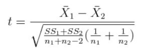
28 |
That's pretty intimidating, but let's look at it calmly for a moment. I call your attention to that first bit under the square root sign in the denominator. You've seen that before. What is that? Correct! That's the pooled variance for two groups. The square root of it is the pooled standard deviation. So it appears that, at least in part, we are dividing the difference between the means by the pooled standard deviation, and then there's some other stuff involving the groups sizes. Allow me to rewrite the t-statistic formula as follows. 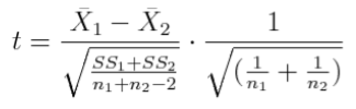
So the first part of the formula compares the difference between the means to the (average) size of the standard deviation. You've seen that before, too. It's a statistic called Cohen's d, and it is a frequently used measure of how large the effect is. 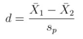
So I'm going to encourage you not to start off with a direct calculation of t, but to begin with a calculation of effect size, using Cohen's d. The difference between the means, we know, is 3.10, and the pooled standard deviation is 4.98. So Cohen's d = 3.10 / 4.98 = 0.6225. I'm going to carry an unjustified significant digit. We'll round at the end, a good practice. What does Cohen's d mean. Jacob Cohen (who was a psychologist, you may be interested to know) stated that a d-value of 0.2 represents a small effect size, one probably not easily noticeable without statistical analysis. A d-value of 0.5 represents a moderate effect size, one that a discerning observer might notice. A d-value of 0.8 represents a large effect size, one that should be easily noticed by even casual observers. Our d-value is somewhat larger than 0.5 but smaller than 0.8, so how do we interpret it? A lot of intro stat books establish ranges for Cohen's d, one of which is 0.5-0.8, which is said to be a moderate effect size. But Cohen never said such a thing. Cohen said that his d-values give us a rough idea of the effect size. They are not meant to be used with anal retentive false precision. So 0.6 is between moderate and large, closer to moderate. Live with it! (Personally, I like to remember it as 0.25 is small, 0.5 is moderate, and 1.0 is large. It's easier. When the mean difference is about the same size as the pooled sd, that's a large effect.) Now for the second part of the t-statistic formula. For a balanced design, the part under the square root sign simplifies to 2/n, where n is the common group size. A tad more algebraic manipulation results in the following formula for a t-statistic, useful only when the design is balanced. (We will generalize it to unbalanced designs later.) 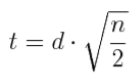
In the case of the Eysenck study, n = 50 subjects per group, 50/2=25, and the square root of 25 is 5. So t equals 0.6225 times 5, or, rounding a bit at this point, 3.11. Degrees of freedom associated with this value can be found from the common rule that, in between groups designs, error degrees of freedom is total number of subjects minus the number of groups. So df = 100 - 2 = 98. Now what does all of this mean? What decision does it allow us to make? For that we need, for the time being, to use the following table of the t-distribution (or one like it). 29 |
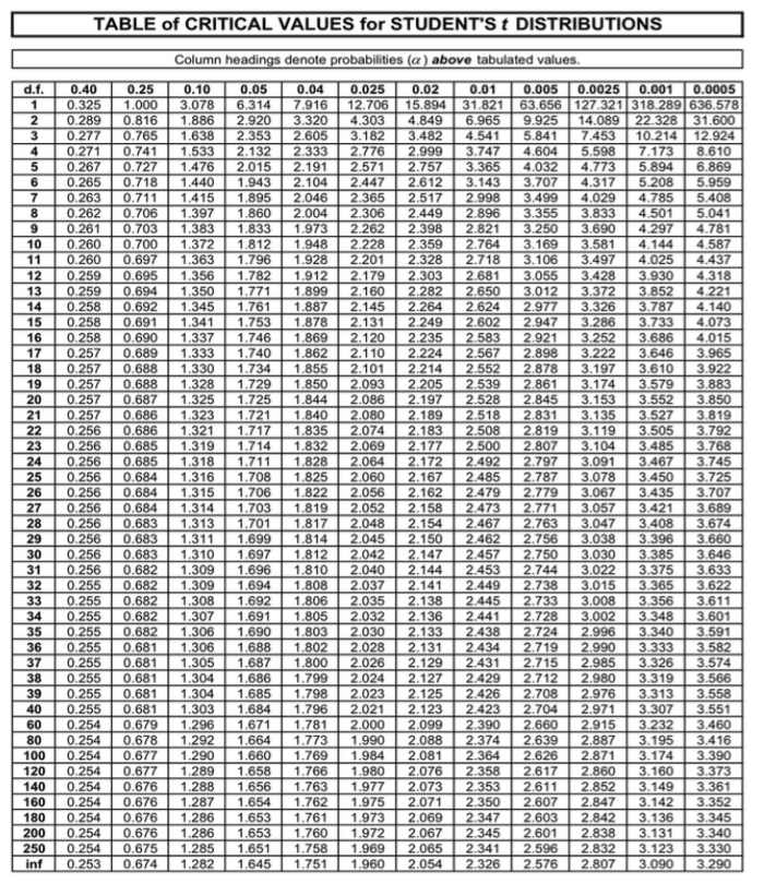
Degrees of freedom are in the far left-hand column. Notice 98 is not listed. The custom in such cases is to go to the next lower value that is listed, which would be 80. Whether we go to 80 or to 100 isn't going to make any difference in this case, so let's use 100 because it's easier (for me anyway) to follow that line of the table. We read across that line until will come to the first value that is larger than our calculated value. That would be 3.174 in the next to last column. We make a note of the value in bold at the top of that column, which is 0.001. Noted. Then we drop back to the preceding column, where the tabled value is 2.871, the last value in the line that is less than our calculated value. And we make a note of the value in bold at the top of that column, which is 0.0025. (Confirm that we get the same thing if we use the line for df = 80.) 30 |
There is one more thing we need to know--are these tabled values one-tailed values or two-tailed values? We'll discuss the difference later, but from the note at the top of the table, we can see that they are one-tailed. The boldfaced values in the top line of the table are the areas in one tail under the t-distribution, above the tabled values of t. Thus, for 100 degrees of freedom, the area above the tabled value of 2.871 is 0.0025, and the area above the tabled value of 3.174 is 0.001. And what is area under one of these distribution curves? Probability, correct! That's why it's called a probability distribution. If all was done correctly, and all has gone well, the probability of doing an experiment like the Eysenck experiment in which the null hypothesis is true, and seeing a difference between two groups that results in a calculated t-value of more than 3.174 is 1/1000 or 0.001. The probability of seeing a difference between two groups that results in a calculated t-value of 2.871 or more is 0.0025. These are one-tailed values that would be used if our alternative hypothesis had specified in what direction the difference between the groups would go, a so-called directional hypothesis. Our alternative hypothesis did not specify such a direction. It just said there would be a difference, one way or the other, a so-called nondirectional hypothesis. So we need two-tailed probability values. Not a problem. Just double the one-tailed values to get the two tailed values. Thus, the probability of doing an experiment like the Eysenck experiment in which the null hypothesis is true, and seeing a difference between two groups that results in a calculated t-value of more than 3.174 neglecting the sign (or of 3.174 or more--same thing) is 2/1000 or 0.002. The probability of seeing a difference between two groups that results in a calculated t-value of 2.871 or more is 0.005. These values are called p-values. Clearly, the exact p-value for our calculated t of 3.11 is somewhere between them. A p-value is the probability of seeing a result as large or larger than the observed one if the null hypothesis is true. If the p-value is less than the alpha level, then we conclude that the null hypothesis probably is not true, and we reject it. So the alpha level is the maximum p-value that we are willing to accept as evidence that the null hypothesis is not true. Our p-value is between 0.002 and 0.005, which is certainly less than 0.05, so we reject the null hypothesis and decide in favor of the alternative. We have not proved the alternative, but we have supported it. Remember, the hypotheses are about the population, and we have not seen the population. We are making guesses about the population based on a sample. So we should be conservative in the conclusions we draw about something we have not seen! We may now say that a statistically significant difference was found between the mean of the younger group and the mean of the older group. What this means is that we are concluding that the difference we observed between these two groups probably did not come about due to random error. This is unlikely to be dumb luck. This is probably something real, either due to the IV or a confound. When we talk about statistical significance, we are always talking about the sample, never about the population. Since the sample is something that's over and done with, we speak in the past tense. One more thing. If I ever see you write or hear you say "the data were significant," I'll fail you on the spot!! Data are not significant. Differences are significant. Effects are significant. I'll even settle for results being significant, which is loose talk, but data are not significant. Don't say it!! And don't ever say the population means are significantly different, in any way, shape, or form. Don't say, for example, that "younger people have significantly greater recall from word lists than older people." That is a statement about what is generally true, about younger people and older people in general, about the population, not about the sample. The population means are either different or they are not. There is nothing statistically significant about that. 31 |
XIII. Decision Errors--We All Make Them. Don't we? We have made a decision in favor of the alternative hypothesis. Was it the right decision? It was a decision about the population, after all, and we have not seen the population. Admit it. We could be wrong! Of the billions of people in the world, we have observed 100. It would certainly be the height of hubris to conclude that we now know the truth about people. Statistical methods are powerful if used properly, but they are not perfect. There are two kinds of errors we can make. 1) We can decide the null hypothesis is wrong, i.e., we can reject the null, when in fact the null is correct. In other words, we can see an effect when there isn't one. This is called a Type I error. 2) We can decide that the null hypothesis is correct (or at least fail to reject it), when in fact the null hypothesis is incorrect. In other words, we can fail to see an effect when there is one. This is called a Type II error.There are probabilities associated with each of these kinds of errors. If the null hypothesis is true (there really is no difference between the groups in population), then the probability of rejecting it (a Type I error) is equal to our alpha level. We can set the alpha level arbitrarily at any value we want, or so we're told, but customarily the alpha level is set at .05 or lower. I emphasize "point oh five," 1/20, not point five, 1/2. This is a common error made by beginning stat students. Be careful of it. If the null hypothesis is false (there really is a difference between the groups), then the probability of failing to find it to be false, of failing to reject the null, is called beta (β). Beta must be calculated, and often calculating it is not an easy thing. The value of beta depends on the sample size, the effect size, the value of alpha, and a few other things. One minus beta (1 - β) is the probability of finding an effect when one really exists. This is called the power of the test. Obviously, finding an effect when one exists is a good thing, so high power is desirable. In fact, it has become customary to attempt to design experiments in such a way that power to find an effect, if it exists, is at least .80 (or an 80% chance). Thus ends our statistical review. I can't leave you without practice problems, however, so let me tell you something else about the Eysenck experiment. In addition to dividing his subjects into young and old, Eysenck also randomly assigned his subjects to five different instructions conditions. Some of the subjects were told just to count the letters in the words they saw. They were not told to memorize the words or that they would eventually be asked to recall them. Another group was told only to think of words that rhyme with the words on the list. A third group was told to think of adjectives that could be used the modify the words on the list if they were used in a sentence. A fourth group was told to form visual images of the objects described by the words on the list. Finally, a control group was told to memorize the words, that they would eventually be asked to recall them. Obviously, these conditions can be compared pairwise (two at a time). This may not be the best idea when it comes to analyzing this condition of the experiment, but it's what you know how to do after reading this review. So do it. Practice. There are 10 possible pairwise comparisons that can be made. For example, you can compare the counting condition to the adjective condition. Most of those comparisons will be statistically significant at the .05 level. A couple don't even come close. Have at it. Here are the data. The conditions are listed in alphabetical order for no particularly good reason. Of course, you will begin with descriptive statistics, so start at the beginning. Be thorough. Adjective 10 7 14 7 13 11 13 11 13 11 14 22 18 13 15 17 10 12 12 15 Control 10 14 5 11 12 19 15 14 10 10 18 21 21 18 16 22 22 22 18 15 Counting 6 10 7 9 6 7 6 9 4 6 7 9 7 7 5 7 7 5 4 7 Imagery 23 19 10 12 11 10 16 12 10 11 15 16 14 20 17 18 15 20 19 22 Rhyming 6 6 10 8 10 3 5 7 7 7 6 10 6 8 10 7 7 9 9 4 32 |
Appendix: Key terms and concepts Yes, I know it's a lot of stuff, but you've seen it all before. This is review.
33 |