
| Table of Contents
| Function Reference
| Function Finder
| R Project |
DESCRIBING DATA GRAPHICALLY
Introduction
The graphical procedures in R are extremely powerful. I'm told there are
people who use R not so much for data analysis as for its ability to produce top
notch publication quality graphics. I will only scratch the surface of these
capabilities here. A later tutorial will fill in a few more of the details.
Don't make the mistake of assuming that this tutorial is in any fashion a
complete summary of R graphics capabilities. It is a brief overview of how to
get a mostly quick-and-dirty graph to visualize your data.
R graphics functions can be grouped into three types:
- High level plotting functions that will create a more or less complete
graph, often with axis labels, titles, and so forth.
- Low level plotting functions that allow additional information to be
added to an existing graph, or that allow graphs to be drawn from
scratch.
- Interactive graphics functions that allows the R user to extract
information from an existing graph, or to label points and so on.
I'm going to do something unusual, and perhaps ill-advised, and cover the
low level functions first, so that you will be ready to use them in conjunction
with the high level functions when we get to those. If you just want the quick
and dirty approach, then skip this first section (for now).
Low Level Plotting Functions

For years I told my students, "I can draw anything I want in an R graphics
window. I can draw a clown face in an R
graphics window if I want to." Finally a student challenged me to do it. It took
me the better part of a day to figure out!
To conserve space, I'm not going to reproduce the output of every
single example in this tutorial. If you have
R open and are following along, you can see it on your own screen.
High level plotting functions open a graphics device (window) automatically,
but the low level functions do not. So to get a graph and some axes to work
with, the following command will get us started without actually drawing a
graph.
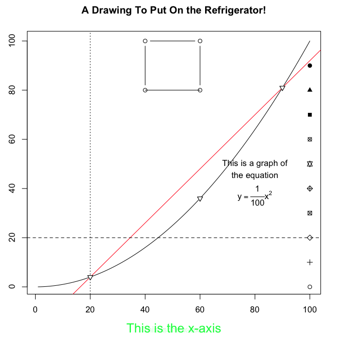
> plot(1:100, 1:100, type="n", xlab="", ylab="")
The plot() function is high level, opening a
graphics window and drawing labeled axes, but in this case we've asked it not
to plot anything with the type="n" option. Now we have a palette. Let's paint
on it.
One thing we can do is plot a curve from an algebraic equation. Let's use
the equation y = 0.01 x2.
> curve(x^2/100, add=TRUE) # add=T adds the curve to an existing graph
We may want to add some text to the graph, which tells our intended audience
just what it is we've plotted.
> text(x=80, y=50, "This is a graph of")
> text(x=80, y=45, "the equation")
> text(x=80, y=37, expression(y == frac(1,100) * x^2))
The text() function takes, first, arguments
that give x,y-coordinates at which the text will be centered (and this can take
some careful eyeballing or some trial and error), and then it takes quoted text
or a mathematical expression. The syntax for the expression() function is an art form in itself
(similar to LaTeX), and I have not mastered it, but it can be used to produce
some very fancy mathematical expressions. There are also options for
controlling font face and size as well as spacing, etc.
Next let's draw some points on this curve.
> points(x=c(20, 60, 90), y=c(4, 36, 81), pch=6) # or points(x<-c(20,60,90), y=x^2/100, pch=6)
The first vector gives the x-coordinates of the desired points, the second
vector gives the y-coordinates (which can be calculated on the fly), and the
"pch=" option gives the point character to use. There are about twenty different
point characters to choose from. To see some of them, do this.
> points(x=rep(100,10), y=seq(0,90,10), pch=seq(1,20,2))
You can experiment for yourself to find out what the rest of them look like.
Now let's draw a straight line through a couple of those points, say the one
at (20, 4) and the one at (90, 81). The draw-a-straight-line function is abline(), and in this case it's arguments are
"a=the y-intercept" and "b=the slope" of the desired line.
> abline(a=-18, b=1.1, col="red")
And just to be showy, we made it red with col="red". We can also draw
horizontal and vertical lines with this function.
> abline(h=20, lty=2)             # abline(h=20, lty="dashed") also works
> abline(v=20, lty=3)             # abline(v=20, lty="dotted") also works
The "lty=" option specifies the line type (1=solid, 2=dashed, 3=dotted). You
can also change the color of these lines with col=, and the width of the lines
with lwd= options. Try repeating that last command but set lty=1 and lwd=3.
We can also draw lines and/or points using the
lines() function.
> lines(x=c(40, 40, 60, 60), y=c(80, 100, 100, 80), type="b")
> lines(x=c(40, 60), y=c(80, 80), type="l")      # type="lower case L", not "one"
Once again, the first vector gives the x-coordinates, the second vector the
y-coordinates, and the "type=" option tells whether you want just points
(type="p"), just lines (type="l"), or both (type="b"). Note: For just lines,
use a lower case L. This example shows that type="l" and type="b" behave a bit
differently in terms of where the line begins and terminates.
Finally, at least as far as this tutorial is concerned, titles and axis
labels can be added using the title()
function. (NOTE: If you already have axis labels (they are set by default in the
plot() function, but we set them to blank by setting
xlab="" and ylab=""), you can try a little trick that SOMETIMES works to
erase them. Try writing over them in the background color of the graph, in this
case, white. This brings up an IMPORTANT POINT. Be careful when you're drawing
a complex graph, because it's generally true that, when you make a mistake, you
start again! It's advisable to use the script window to write out the commands
for a complex graph.)
> title(main="A Drawing To Put On the Refrigerator!")
> title(xlab="This is the x-axis", col.lab="green", cex.lab=1.5)
This example also gives a little taste of how various options can be used to
control colors, fonts, text sizes, and so forth. We'll do more of this in a
future tutorial. The col.lab= option sets the color of the label, while the
cex.lab= option controls it's size. "cex" stands for character expansion factor,
so setting cex.lab=1.5 makes the label 1.5 times it's normal size. And now
let's have a look at our masterpiece.
 Beautiful! Okay, so it's a little first-graderish as R graphics go. There are
entire books on R graphics, and I am but a novice! Here is the entire script
if you just now have decided you want to see this happen on your own
monitor.
Beautiful! Okay, so it's a little first-graderish as R graphics go. There are
entire books on R graphics, and I am but a novice! Here is the entire script
if you just now have decided you want to see this happen on your own
monitor.
# start copying here
plot(1:100, 1:100, type="n", xlab="", ylab="")
curve(x^2/100, add=TRUE)
text(x=80, y=50, "This is a graph of")
text(x=80, y=45, "the equation")
text(x=80, y=37, expression(y == frac(1,100) * x^2))
points(x=c(20,60,90), y=c(4,36,81), pch=6)
points(x=rep(100,10), y=seq(0,90,10), pch=seq(1,20,2))
abline(a=-18, b=1.1, col="red")
abline(h=20, lty=2)
abline(v=20, lty=3)
lines(x=c(40,40,60,60), y=c(80,100,100,80), type="b")
lines(x=c(40,60), y=c(80,80), type="l")
title(main="A Drawing To Put On the Refrigerator!")
title(xlab="This is the x-axis", col.lab="green", cex.lab=1.5)
# stop copying here and paste to your R Console
You can also paste this into a script window (File > New Document on a Mac,
File > New Script in Windows) and experiment with it. Learn by doing!
High Level Plotting Functions
Usually, we don't want to fuss that much. We just want to see a graph of
some data we're examining. If we want to dress it up for publication, THEN we'll
worry about the low-level functions and various options.
The basic high level plotting function is
plot(), and it works differently depending upon what you're asking
it to plot. The basic syntax is plot(x, y, ...), where x is a vector of
x-coordinates, y is a vector of y-coordinates, and ... represents further
refinements and options, as will be illustrated.
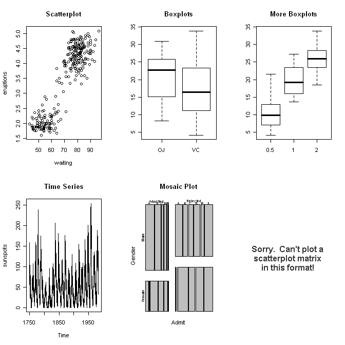
> data(faithful)
> attach(faithful)
> names(faithful)
[1] "eruptions" "waiting"
> plot(x=waiting, y=eruptions)         # x is num., y is num., plot is a scatterplot
> detach(faithful)
> rm(faithful)
>
>
> data(ToothGrowth)
> attach(ToothGrowth)
> names(ToothGrowth)
[1] "len"  "supp" "dose"
> plot(x=supp, y=len)                  # x is factor, y is num., plot is boxplots
> plot(x=factor(dose), y=len)          # coercing dose to a factor
> detach(ToothGrowth)
> rm(ToothGrowth)
>
>
> data(sunspots)
> class(sunspots)
[1] "ts"
> plot(sunspots)                       # x is time series, y missing, plot is a
> rm(sunspots)                         #     time-series plot
>
>
> data(UCBAdmissions)
> class(UCBAdmissions)
[1] "table"
> plot(UCBAdmissions)                  # x is table, y missing, plot is a mosaic plot
> rm(UCBAdmissions)
>
>
> data(mtcars)
> str(mtcars)
'data.frame':   32 obs. of  11 variables:
 $ mpg : num  21 21 22.8 21.4 18.7 18.1 14.3 24.4 22.8 19.2 ...
 $ cyl : num  6 6 4 6 8 6 8 4 4 6 ...
 $ disp: num  160 160 108 258 360 ...
 $ hp  : num  110 110 93 110 175 105 245 62 95 123 ...
 $ drat: num  3.9 3.9 3.85 3.08 3.15 2.76 3.21 3.69 3.92 3.92 ...
 $ wt  : num  2.62 2.88 2.32 3.21 3.44 ...
 $ qsec: num  16.5 17.0 18.6 19.4 17.0 ...
 $ vs  : num  0 0 1 1 0 1 0 1 1 1 ...
 $ am  : num  1 1 1 0 0 0 0 0 0 0 ...
 $ gear: num  4 4 4 3 3 3 3 4 4 4 ...
 $ carb: num  4 4 1 1 2 1 4 2 2 4 ...
> plot(mtcars)                         # x is dataframe of num. vars., y missing,
> rm(mtcars)                           #     plot is a scatterplot matrix
>
 And so on. I think I've made my point. As we go through the individual data
analyses in future tutorials, we will
see these various plots again, and we will dress them up a bit. So for now, let
me just illustrate a few other things R can do.
And so on. I think I've made my point. As we go through the individual data
analyses in future tutorials, we will
see these various plots again, and we will dress them up a bit. So for now, let
me just illustrate a few other things R can do.
Note: Plotting can also be done with a formula interface:
plot(y ~ x).
Pie Charts and Bar Graphs
When a single categorical variable is being graphed, the customary way is to
use a pie chart or a bar graph. Statisticians are somewhat biased against
pie charts, and I suppose for good reason, but I'll illustrate them anyway, just
in case you have a hankerin' to flout good statistical practice.
The data set UCBAdmissions, which we were using above, is the Berkeley
admissions data we used in a different form in a previous tutorial. The data set
is a 3-D table, and we need a 1-D table to illustrate a basic piechart and
barplot, so...
> margin.table(UCBAdmissions, 3)       # Collapse over dimensions 1 and 2.
Dept
  A   B   C   D   E   F
933 585 918 792 584 714
> margin.table(UCBAdmissions,3) -> Department
> pie(Department)
> barplot(Department, xlab="Department", ylab="frequency")
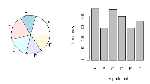 I think you can see why the bar graph is preferred. It's much easier to read.
The pie() function in R is limited because,
as I mentioned above, many statisticians (including the R folks) consider pie
charts to be poor statistical practice. However, if you want something flashy
like a 3D exploded pie chart, you can get it by installing an optional graphics
package called "plotrix", which contains a function called
pie3D(), which has an "explode" option. It just goes to show, if
you want it, someone has probably written an R package that will do it! To
see an example of an exploded pie chart produced with this package, try
this link. In fact, I recommend the plotrix package if you want some
useful extensions to the basic R graphics capabilities.
I think you can see why the bar graph is preferred. It's much easier to read.
The pie() function in R is limited because,
as I mentioned above, many statisticians (including the R folks) consider pie
charts to be poor statistical practice. However, if you want something flashy
like a 3D exploded pie chart, you can get it by installing an optional graphics
package called "plotrix", which contains a function called
pie3D(), which has an "explode" option. It just goes to show, if
you want it, someone has probably written an R package that will do it! To
see an example of an exploded pie chart produced with this package, try
this link. In fact, I recommend the plotrix package if you want some
useful extensions to the basic R graphics capabilities.
If you want to look at two categorical variables at once, a stacked barplot,
or better yet, a side-by-side barplot is usually the way to go.
> margin.table(UCBAdmissions, c(1,3)) -> Admit.by.Dept
> barplot(Admit.by.Dept)
> barplot(Admit.by.Dept, beside=T, ylim=c(0,1000), legend=T,
+         main="Admissions by Department")
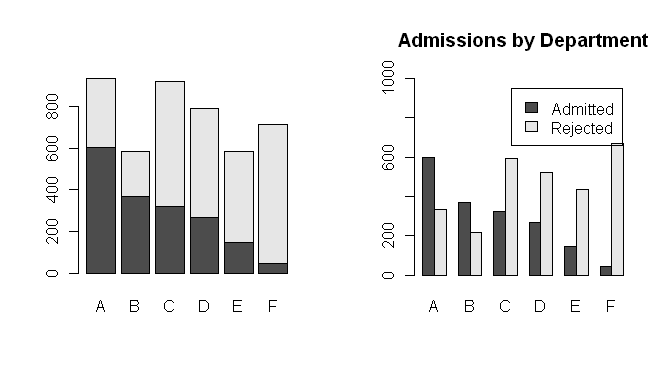 Notice a stacked barplot is the default for some odd reason. To change that,
set the "beside=" option to TRUE. Also, I dressed up the second barplot a bit
by adding a main title, and by changing the limits on the y-axis to (almost!)
make enough room for a legend. I
need to adjust the font size a bit in the legend, and maybe change its location,
but that's a future tutorial!
Notice a stacked barplot is the default for some odd reason. To change that,
set the "beside=" option to TRUE. Also, I dressed up the second barplot a bit
by adding a main title, and by changing the limits on the y-axis to (almost!)
make enough room for a legend. I
need to adjust the font size a bit in the legend, and maybe change its location,
but that's a future tutorial!
Histograms
When you have one numeric variable to look at, a histogram is appropriate.
I'll use the "faithful" data set again to illustrate.
> data(faithful)                       # This is optional.
> attach(faithful)
> hist(waiting)
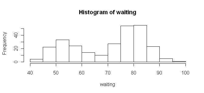 It doesn't get much more straightforward than that! And by the way, in case
you're wondering, I resized the graphic by resizing the graphics device window
before saving it. There are better ways, but that works pretty well in a pinch.
It doesn't get much more straightforward than that! And by the way, in case
you're wondering, I resized the graphic by resizing the graphics device window
before saving it. There are better ways, but that works pretty well in a pinch.
If you want more or fewer bars, you can refine your plot by using the
"breaks=" option and defining your own breakpoints.
> range(waiting)
[1] 43 96
> hist(waiting, breaks=seq(from=40, to=100, by=10))
By default, R includes the right limit (right side of the bar) but not the left
limit in the intervals. Usually, I prefer it the other way around, so I change
it with the "right=" option, which by default is TRUE.
> hist(waiting, breaks=seq(40,100,10), right=F)
There are many, many other options as well, which you can examine by looking at
the help page for this function: type ?hist.
R also incorporates many functions for data smoothing, including kernel
density smoothing of histograms. If you'd rather see a smooth curve than a
boxy histogram, it can be done as follows.
> plot(density(waiting))
> # Or, getting fancier...
> hist(waiting, prob=T)
> lines(density(waiting))
> detach(faithful)
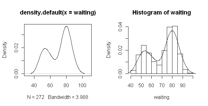 The density() function does kernel density
smoothing, which can be refined by adjusting the options of the function. To
plot the smoothed curve on top of a histogram, set the "prob=" option to TRUE
inside the hist() function. This plots
densities rather than frequencies. Also, use lines() rather than plot() to draw the smoothed curve. This low level
graphics function will add the smoothed curve to the histogram rather than
drawing a new plot and thereby erasing the histogram.
The density() function does kernel density
smoothing, which can be refined by adjusting the options of the function. To
plot the smoothed curve on top of a histogram, set the "prob=" option to TRUE
inside the hist() function. This plots
densities rather than frequencies. Also, use lines() rather than plot() to draw the smoothed curve. This low level
graphics function will add the smoothed curve to the histogram rather than
drawing a new plot and thereby erasing the histogram.
Numerical Summaries by Groups
When you have a numerical variable indexed by a categorical variable or
factor, you might want a group-by-group summary in graphical form. The primary
way R offers to achieve this is side-by-side boxplots.
> data(chickwts)                  # Weight gain by type of diet.
> str(chickwts)
'data.frame':   71 obs. of  2 variables:
 $ weight: num  179 160 136 227 217 168 108 124 143 140 ...
 $ feed  : Factor w/ 6 levels "casein","horsebean",..: 2 2 2 2 2 2 2 2 2 2 ...
> attach(chickwts)
> plot(feed, weight)              # boxplot(weight ~ feed) will also work
> title(main="Body Weight of Chicks by Type of Diet")
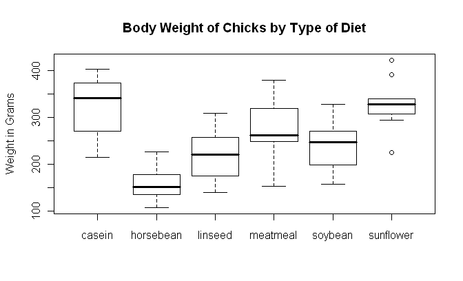 One somewhat annoying thing about boxplots is that they don't display means. If
you're doing a parametric analysis such as t-test or ANOVA, those are tests on
means, so your graphic ought to display means. You can add means by using the
low-level points() function. (Watch your screen, I
won't reproduce this here.)
One somewhat annoying thing about boxplots is that they don't display means. If
you're doing a parametric analysis such as t-test or ANOVA, those are tests on
means, so your graphic ought to display means. You can add means by using the
low-level points() function. (Watch your screen, I
won't reproduce this here.)
> means = tapply(weight, feed, mean)
> points(x=1:6, y=means, pch=16)       # pch=16 is a filled circle
> detach(chickwts)
The function boxplot(), which takes a formula
interface, can also be used. Here is the example copied and pasted off the
"chickwts" help page.
> boxplot(weight ~ feed, data = chickwts, col = "lightgray",
+     varwidth = TRUE, notch = TRUE, main = "chickwt data",
+     ylab = "Weight at six weeks (gm)")
Warning message:
In bxp(list(stats = c(216, 271.5, 342, 373.5, 404, 108, 136, 151.5,  :
  some notches went outside hinges ('box'): maybe set notch=FALSE
Notice that several options are set, including an option to color the boxes, the
"varwidth=" option, which sets the width of the box according to the sample
size, the "notch=" option, which gives a confidence interval around the median,
and options to print a main title and y-axis label. The procedure generated a
warning message, which you will understand when you look at the graphic (which
I have not reproduced here).
Scatterplots
For examining the relationship between two numerical variables, you can't
beat a scatterplot. R has several functions for producing them, two of which
will be demonstrated here.
> data(mammals, package="MASS")
> str(mammals)
'data.frame':   62 obs. of  2 variables:
 $ body : num    3.38   0.48   1.35 465.00  36.33 ...
 $ brain: num   44.5  15.5   8.1 423.0 119.5 ...
> attach(mammals)
> plot(log(body), log(brain))          # plot(x=body, y=brain, log="xy") is similar (try it)
> scatter.smooth(log(body), log(brain))
> detach(mammals)
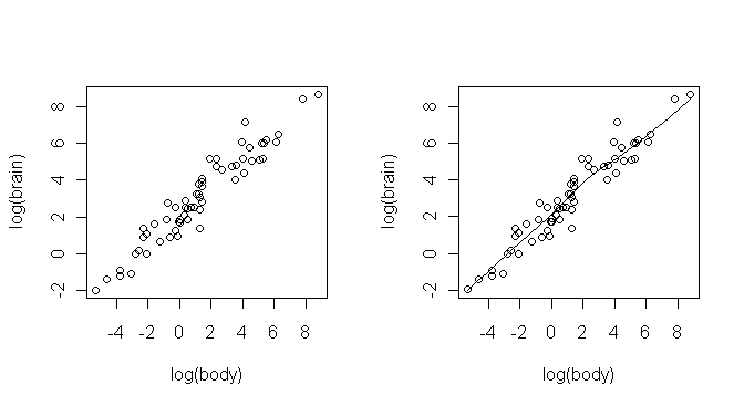 Some explanations are in order. First, I didn't want to attach the MASS package
to the search path, so I used an option when I copied the "mammals" data frame
that told R to look for it there. The data frame contains brain and body
weights from 62 species of land mammals. Second, to produce a linear plot, I
had to do a log transform on both variables, and I did that "on the fly."
Third, the two functions produced the same scatterplot, but the scatter.smooth() function also plots a smoothed,
nonparametric regression line on the plot. This line is computed using the
loess technique and is called the "loess line" (locally weighted scatterplot
smoothing, sometimes also called "lowess", although I understand some sources
use the two acronyms differently). Both functions have options that allow the
plots to be modified in several ways.
Some explanations are in order. First, I didn't want to attach the MASS package
to the search path, so I used an option when I copied the "mammals" data frame
that told R to look for it there. The data frame contains brain and body
weights from 62 species of land mammals. Second, to produce a linear plot, I
had to do a log transform on both variables, and I did that "on the fly."
Third, the two functions produced the same scatterplot, but the scatter.smooth() function also plots a smoothed,
nonparametric regression line on the plot. This line is computed using the
loess technique and is called the "loess line" (locally weighted scatterplot
smoothing, sometimes also called "lowess", although I understand some sources
use the two acronyms differently). Both functions have options that allow the
plots to be modified in several ways.
Interacting With Plots
R supplies several functions that allow you to interact with the graphics
window, including functions that allow you to identify and label points on the
graph. See the help pages for the locator()
and identify() functions for details. I'll
discuss these briefly in a later tutorial.
Remember to clean up your workspace!
revised 2016 January 31
| Table of Contents
| Function Reference
| Function Finder
| R Project |
|