
| Table of Contents
| Function Reference
| Function Finder
| R Project |
FACTORIAL BETWEEN SUBJECTS ANOVA
Preliminaries
Model Formulae
You would probably profit from reading the Model
Formulae tutorial before going on.
Complexities
Anyone who had a graduate school course in analysis of variance is probably
still having flashbacks. Experimental designs can become extremely complex,
with complications like nesting, blocking, split-plot, Latin square, etc. In
this short tutorial, I will stick to the basics, which is to say I will stick to
factorial designs (which involve replication in the design cells) that are
entirely between subjects and that involve no restrictions on randomization
(e.g., such as blocking, etc.).
While we're on the topic of complexity, I should add a comment about keeping
experimental designs balanced (i.e., equal numbers of subjects in each cell of
the design). In single-factor designs, this is not so crucial, as unbalancing
the design has the primary effect of making the ANOVA more sensitive to
violation of assumptions. However, when a factorial design becomes unbalanced,
either because of subject attrition or because the study is observational in
nature and subjects were "taken as they came," then the factors lose their
independence from one another. BALANCED DESIGNS ONLY will be discussed in
this tutorial. Unbalanced Factorial Designs now
have a tutorial to themselves. If you have an unbalanced factorial design and
are not familiar with the issues involved, READ THAT TUTORIAL before using
these procedures.
Summarizing Factorial Data
For this tuturial, we will examine data on the effect of vitamin C on tooth
growth in guinea pigs.
> data(ToothGrowth)
> str(ToothGrowth)
'data.frame':   60 obs. of  3 variables:
 $ len : num  4.2 11.5 7.3 5.8 6.4 10 11.2 11.2 5.2 7 ...
 $ supp: Factor w/ 2 levels "OJ","VC": 2 2 2 2 2 2 2 2 2 2 ...
 $ dose: num  0.5 0.5 0.5 0.5 0.5 0.5 0.5 0.5 0.5 0.5 ...
 > summary(ToothGrowth)
      len        supp         dose
 Min.   : 4.20   OJ:30   Min.   :0.500
 1st Qu.:13.07   VC:30   1st Qu.:0.500
 Median :19.25           Median :1.000
 Mean   :18.81           Mean   :1.167
 3rd Qu.:25.27           3rd Qu.:2.000
 Max.   :33.90           Max.   :2.000
The variables are "len", which is tooth length, the response variable, the way
in which the supplement was administered, "supp", of which the levels are "OJ"
(as orange juice) and "VC" (as ascorbic acid), and "dose" of the supplement in
milligrams (0.5, 1.0, and 2.0). To begin, we should note that R considers "dose"
to be numeric. If we want dose treated as a factor (we do), we will have to be
absolutely certain that R sees it as such
when we construct the model formula. Otherwise, we will end up with an analysis
of covariance, which is not what we want.
First, let's end all doubt that we want "dose" to be a factor.
> ToothGrowth.bak = ToothGrowth
> ToothGrowth$dose = factor(ToothGrowth$dose,
+                        levels=c(0.5,1.0,2.0),
+                        labels=c("low","med","high"))
> summary(ToothGrowth)
      len        supp      dose
 Min.   : 4.20   OJ:30   low :20
 1st Qu.:13.07   VC:30   med :20
 Median :19.25           high:20
 Mean   :18.81
 3rd Qu.:25.27
 Max.   :33.90
The function factor() is used to declare
"ToothGrowth$dose" as a factor,
with levels currently coded as 0.5, 1.0, and 2.0, but now recoded with labels
of "low", "med", and "high". Just to be sure, I looked at a summary. Can't be
too careful. And be ESPECIALLY CAREFUL with the factor()
function. One little typo here can turn your data to garbage. I'd recommend
making a backup copy of the data frame before fooling with it like that.
Which you'll notice I did. I've learned that the hard way!
Now let's check for a balanced design by crosstabulating the factors. Note:
You could do it fancier by using
replications(len~supp*dose, data=ToothGrowth),
but crosstabling the factors is easier and gives a more straightforward answer.
> with(ToothGrowth, table(supp, dose))
    dose
supp low med high
  OJ  10  10   10
  VC  10  10   10
We find that we have 10 subjects (teeth--actually odontoblasts) in each of
the 2x3=6 design cells. We have to assume that each of these tooth measurements
is an independent measurement. For example, it would be bad news if more than
one of these measurements came form the same subject.
There are a number of ways the data can be summarized graphically. First,
let's look at boxplots.
> boxplot(len ~ supp * dose, data=ToothGrowth,
+         ylab="Tooth Length", main="Boxplots of Tooth Growth Data")
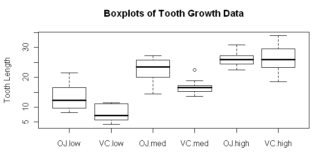 Try dose * supp and see how the boxplots change. In the meantime, we should
definitely make a note to check our homogeneity and normality assumptions! We
might get a better idea of what our main effects and interactions look like
if we look at a traditional interaction plot, also called a profile plot.
Try dose * supp and see how the boxplots change. In the meantime, we should
definitely make a note to check our homogeneity and normality assumptions! We
might get a better idea of what our main effects and interactions look like
if we look at a traditional interaction plot, also called a profile plot.
> with(ToothGrowth, interaction.plot(x.factor=dose, trace.factor=supp,
+                     response=len, fun=mean, type="b", legend=T,
+                     ylab="Tooth Length", main="Interaction Plot",
+                     pch=c(1,19)))
 The syntax is straightforward, but there are a lot of options. First,
"x.factor=" specifies the factor to be plotted on the horizontal axis. Second,
"trace.factor=" specifies the factor to plotted as individual lines on the
graph. Third, "response=" specifies the response variable. Fourth, "fun="
specifies the function to be calculated on the response variable. "Mean" is the
default, so we could have left this one out. Fifth, "type=" specifies whether to
plot lines, points, or both. We plotted "b"oth. We also asked for a legend,
a label on the y-axis, and a main title on the graph. Finally, we specified the
point characters to use. We could also have changed the line type, line color,
and just about everything else about the graph, if we wanted to get really
fussy, er, I mean, aRtistic.
The syntax is straightforward, but there are a lot of options. First,
"x.factor=" specifies the factor to be plotted on the horizontal axis. Second,
"trace.factor=" specifies the factor to plotted as individual lines on the
graph. Third, "response=" specifies the response variable. Fourth, "fun="
specifies the function to be calculated on the response variable. "Mean" is the
default, so we could have left this one out. Fifth, "type=" specifies whether to
plot lines, points, or both. We plotted "b"oth. We also asked for a legend,
a label on the y-axis, and a main title on the graph. Finally, we specified the
point characters to use. We could also have changed the line type, line color,
and just about everything else about the graph, if we wanted to get really
fussy, er, I mean, aRtistic.
Another type of graphic we could look at is called a conditioning plot.
I shall borrow the example right off the help page for the ToothGrowth data set.
> coplot(len ~ dose | supp, data=ToothGrowth, panel=panel.smooth,
+       xlab="ToothGrowth data: length vs dose, given type of supplement")
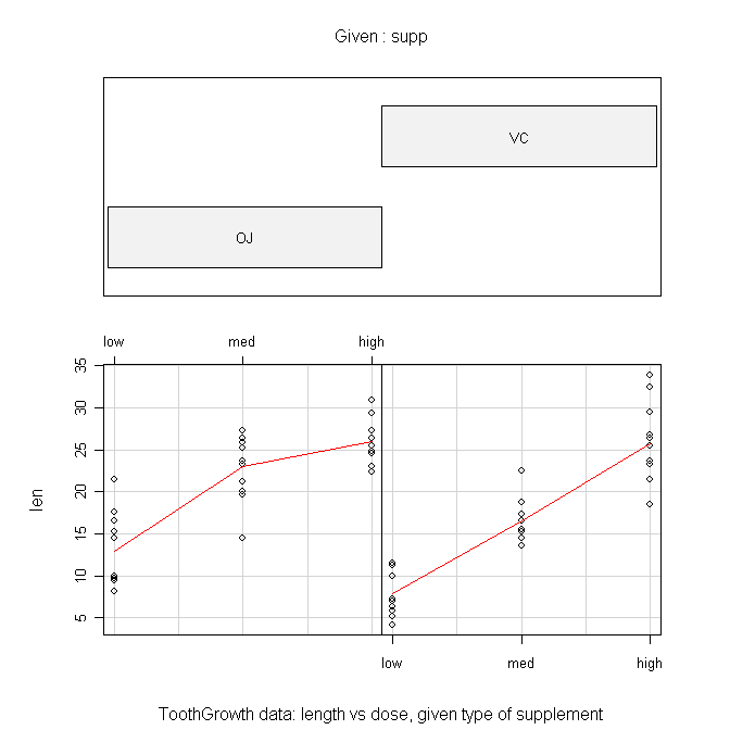
The formula is the tricky part here and should be read as "length by dose
given supplement." The "panel=" option draws the red lines when set to
"panel.smooth". The top panel can be suppressed by setting "show.given=" to
FALSE. This gives a much more sensible looking plot in my humble opinion.
Numerical summaries of the data can be done with the tapply() function.
> with(ToothGrowth, tapply(len, list(supp,dose), mean))
     low   med  high
OJ 13.23 22.70 26.06
VC  7.98 16.77 26.14
> with(ToothGrowth, tapply(len, list(supp,dose), var))
      low       med      high
OJ 19.889 15.295556  7.049333
VC  7.544  6.326778 23.018222
Remember, in tapply(), the first argument is the
response variable, the second argument is a list of factors by which the
response should be partitioned (first factor given will be printed in the rows
of the resulting table), and the third argument is the function you wish to
calculate. Once again, we make note of some consternation over those cell
variances.
We could also use the by() function (same
syntax), but the output is not nearly so concisely formatted. The aggregate() function is tidier, and the function has a
much more convenient formula interface, but I still prefer
the output of tapply().
> aggregate(len ~ supp + dose, ToothGrowth, FUN=mean)
  supp dose   len
1   OJ  low 13.23
2   VC  low  7.98
3   OJ  med 22.70
4   VC  med 16.77
5   OJ high 26.06
6   VC high 26.14
Another way to get similar information is to use the
model.tables() function, but the ANOVA has to be done first and saved
into a model object. (WARNING: Do not do this with unbalanced data. The
answer will NOT be correct!)
> aov.out = aov(len ~ supp * dose, data=ToothGrowth)
Note: The model formula specifies "length as a function of supplement and dose
with all possible interactions between the factors. (The asterisk says "include
the interactions.") Now we can look at some model tables.
> model.tables(aov.out, type="means", se=T)
Tables of means
Grand mean

18.81333

 supp
supp
    OJ     VC
20.663 16.963

 dose
dose
   low    med   high
10.605 19.735 26.100

 supp:dose
    dose
supp low   med   high
  OJ 13.23 22.70 26.06
  VC  7.98 16.77 26.14

Standard errors for differences of means
          supp   dose supp:dose
        0.9376 1.1484    1.6240
replic.     30     20        10
We have requested the various cell and marginal means along with standard errors
for the differences between means. The standard errors are calculated in the
usual way for comparisons by protected t-tests (Fisher LSD). The options must
be explicitly specified, as they are not the defaults (see the help page).
Finally, let's test for homogeneity of variance. The function for the Bartlett
test will not properly handle a factorial design, and it won't warn you about it
either! It'll give you an answer, but that answer will be wrong. The
Fligner-Killeen test function doesn't understand factorial designs either, but
at least it warns you. A work-around is to create a factor that identifies every
one of the design cells individually.
> ToothGrowth$cells = factor(paste(ToothGrowth$supp, ToothGrowth$dose, sep="."))
> summary(ToothGrowth)
      len        supp      dose        cells
 Min.   : 4.20   OJ:30   low :20   OJ.high:10
 1st Qu.:13.07   VC:30   med :20   OJ.low :10
 Median :19.25           high:20   OJ.med :10
 Mean   :18.81                     VC.high:10
 3rd Qu.:25.27                     VC.low :10
 Max.   :33.90                     VC.med :10

> bartlett.test(len ~ cells, data=ToothGrowth)

	Bartlett test of homogeneity of variances

data:  len by cells
Bartlett's K-squared = 6.9273, df = 5, p-value = 0.2261
Aside: The paste() functions "pastes" together
strings. For example:
> paste("horse", "shoe", sep="")
[1] "horseshoe"
Here we used it to paste together the level names from the two factors,
separated by a period. The default separater is a space, by the way.
The leveneTest() function in the "car" package
(not installed by default) appears to handle the formula interface properly,
although the help page is unclear about this.
> library(car)                    # will fail if you haven't installed this package
> leveneTest(len ~ dose * supp, data=ToothGrowth)
Levene's Test for Homogeneity of Variance (center = median)
      Df F value Pr(>F)
group  5  1.7086 0.1484
      54
The cell variances are not significantly different.
Factorial ANOVA
We've already run the ANOVA above when we wanted to look at the model tables,
but just to remind you, the function was as follows.
> aov.out = aov(len ~ supp * dose, data=ToothGrowth)
You do not have to execute it again if you've already done it. This creates a
model object in your workspace, which we've named "aov.out", that contains
a wealth of information. The extension to cases with more factors, for
completely between-groups designs where no Error structure needs to be specified,
would be straightforward. Just list all the factors after the tilde and separate
them by asterisks. This gives a model with all possible main effects and
interactions. To leave out interactions, separate the factor names with plus
signs rather than asterisks.
Before we print anything to the Console, I'm going to turn off the printing
of significance stars because I find them annoying.
> options(show.signif.stars=F)
Now we can look at the ANOVA table using either
summary() or summary.aov().
> summary(aov.out)
            Df  Sum Sq Mean Sq F value    Pr(>F)
supp         1  205.35  205.35  15.572 0.0002312
dose         2 2426.43 1213.22  92.000 < 2.2e-16
supp:dose    2  108.32   54.16   4.107 0.0218603
Residuals   54  712.11   13.19
We see two significant main effects and a significant interaction. In R lingo,
two or more factor names separated by colons refers to the interaction between
those factors. (I warned you there would be another meaning for a colon. There
it is.)
For post hoc tests of main effects, we have the traditional Tukey HSD test.
We don't need a post hoc test on "supp" because it has only two levels, and
the ANOVA has already told us that those groups are significantly different.
So I'll restrict the test to just the "dose" factor. (If you don't do this,
you'll get comparisons between every cell in the table.)
> TukeyHSD(aov.out, which="dose")
  Tukey multiple comparisons of means
    95% family-wise confidence level

Fit: aov(formula = len ~ supp * dose, data = ToothGrowth)

$dose
           diff       lwr       upr   p adj
med-low   9.130  6.362488 11.897512 0.0e+00
high-low 15.495 12.727488 18.262512 0.0e+00
high-med  6.365  3.597488  9.132512 2.7e-06
The degree of confidence required for the confidence intervals can be set using
the "conf.level=" option. The default value is 0.95. Granted, examining main
effects in the presence of a significant interaction is usually not called for,
but I wanted to demonstrate the method.
If you want pairwise t-tests on any factor, you can have them, with a variety
of different methods available for adjusting the p-value for the number of tests
being done (see the help page for details).
> with(ToothGrowth, pairwise.t.test(x=len, g=dose, p.adjust.method="bonferroni"))   # x=DV, g=IV

        Pairwise comparisons using t tests with pooled SD

data:  len and dose

     low     med
med  2.0e-08 -
high 4.4e-16 4.3e-05

P value adjustment method: bonferroni
Enter the response variable as the first argument followed by a comma and then
the grouping variable or factor. Methods available for adjusting the p-values
are holm (default), hochberg, hommel, bonferonni, BH, BY, fdr, and none. The
help page will explain what those are (because I can't). An optional package
called "multcomp" is available that implements additional post hoc multiple
comparison tests. Also, see the Multiple Comparisons
tutorial for more information.
Examining Assumptions Graphically
There are other plots available.
> plot(aov.out, 1)           # visual check of homogeneity of variance
> plot(aov.out, 2)           # visual check of normality
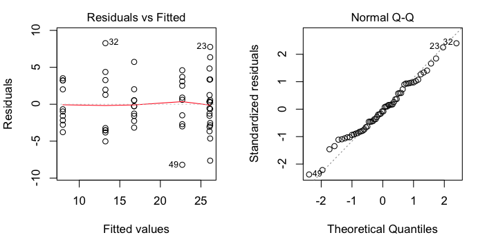 These are regression diagnostic plots, and there are six of them available
altogether. For ANOVA, the first two are the most useful. The first one plots
residuals against fitted values (which are just the cell means). We've got a
bit of a problem with this one as two of the cell means are so close that
residuals from those two cells are being overplotted. That's why we only see
five groups represented. Nevertheless, we can see that there is no obvious
relationship between the size of the cell means and the variability, which is
good. The second plot is a normal probability plot of the residuals, and it
shows that the residuals are not too badly off from being normally
distributed.
These are regression diagnostic plots, and there are six of them available
altogether. For ANOVA, the first two are the most useful. The first one plots
residuals against fitted values (which are just the cell means). We've got a
bit of a problem with this one as two of the cell means are so close that
residuals from those two cells are being overplotted. That's why we only see
five groups represented. Nevertheless, we can see that there is no obvious
relationship between the size of the cell means and the variability, which is
good. The second plot is a normal probability plot of the residuals, and it
shows that the residuals are not too badly off from being normally
distributed.
Contrasts
You should see the Multiple Comparisons tutorial
for a good many of the gory details on contrasts. This section will be a brief
demonstration of how they can be obtained.
First, let's look to see what contrasts we already have.
> contrasts(ToothGrowth$supp)
   VC
OJ  0
VC  1
> contrasts(ToothGrowth$dose)
     med high
low    0    0
med    1    0
high   0    1
These are what the R folks call "treatment contrasts." I'm going to reset them
to something a bit more interesting (although perhaps not in this particular
case).
> options(contrasts = c("contr.helmert","contr.poly"))
> contrasts(ToothGrowth$supp)
   [,1]
OJ   -1
VC    1
> contrasts(ToothGrowth$dose)
     [,1] [,2]
low    -1   -1
med     1   -1
high    0    2
Now we have to redo the ANOVA.
> aov.out2 = aov(len ~ supp * dose, data=ToothGrowth)
And finally we can examine our contrasts.
> summary(aov.out2, split=list(
+                     supp=list("OJ vs VC"=1),
+                     dose=list("low vs med"=1,"low.med vs high"=2)),
+                  expand.split=F
+ )
                        Df Sum Sq Mean Sq F value   Pr(>F)
supp                     1  205.4   205.4  15.572 0.000231 ***
  supp: OJ vs VC         1  205.4   205.4  15.572 0.000231 ***
dose                     2 2426.4  1213.2  92.000  < 2e-16 ***
  dose: low vs med       1  833.6   833.6  63.211 1.19e-10 ***
  dose: low.med vs high  1 1592.9  1592.9 120.789 2.17e-15 ***
supp:dose                2  108.3    54.2   4.107 0.021860 *
Residuals               54  712.1    13.2
---
Signif. codes:  0 '***' 0.001 '**' 0.01 '*' 0.05 '.' 0.1 ' ' 1
Oops! Got significance stars turned back on somehow. The first contrast,
OJ vs VC is just silly, because the ANOVA already gives us this result. The
contrasts for dose are a bit more interesting, although perhaps it would make
more sense to look at linear and quadratic trends here. I leave you at the
mercy of the help page (help(summary.aov)) for
more information.
A note on the expand.split option: When set to FALSE it prevents the
interaction from being split into a bunch of nonsensical contrasts. You'd
think this would be the default. If you don't set it, you'll get a longer
and messier table, part of which you can just ignore.
We should probably reset our contrasts.
> options(contrasts = c("contr.treatment","contr.poly"))
Simple Effects
As we have a significant interaction in this problem, looking at the main
effects post hoc is of questionable value. We should be dissecting the interaction,
and one way to do that is by looking at simple effects. I'm sure there must be
an optional package for this, but I don't know what it is, so I'm going to show
you an easy way to find simple effects by doing a few calculations at the command
line.
We need three things: a table of means, the group size (from the balanced
design), and a function to calculate sums of squares.
> means = with(ToothGrowth, tapply(len, list(supp,dose), mean))
> n.per.group = 10
> SS = function(x)  sum(x^2) - sum(x)^2 / length(x)
See the Functions and Scripts tutorial for an
explanation of the SS function. Or just run the command, which puts the
SS() function in your workspace. Now we're going
to use the apply() function on the means table.
> apply(means, MARGIN=1, FUN=SS) * n.per.group        # simple effects sums of squares for dose
      OJ        VC
885.2647 1649.4887
> apply(means, MARGIN=1, FUN=SS) * n.per.group / 2              # mean squares
      OJ       VC
442.6323 824.7443
> apply(means, MARGIN=1, FUN=SS) * n.per.group / 2 / 13.18715   # F values
      OJ       VC
33.56543 62.54151
> pf(apply(means, MARGIN=1, FUN=SS) * n.per.group / 2 / 13.18715, 2, 54, lower=F)   # p-values
          OJ           VC
3.363197e-10 8.753099e-15
These are the simple main effects of dose by supp levels. Now we can do the same
thing in the columns to get the simple main effects of supp by dose levels.
(Note: This may look like the "hard way," typing these long commands every time,
but in fact I am pressing the up arrow key and just adding the part I need for
the next calculation. What looks like the hard way is actually the easy way!)
> apply(means, MARGIN=2, FUN=SS) * n.per.group             # SSes and MSes as df=1
     low      med     high
137.8125 175.8245   0.0320
> apply(means, MARGIN=2, FUN=SS) * n.per.group / 13.18715  # F values
         low          med         high
10.450514326 13.333017369  0.002426605
> pf(apply(means, MARGIN=2, FUN=SS) * n.per.group / 13.18715, 1, 54, lower=F)
         low          med         high
0.0020924712 0.0005897011 0.9608933868
Finally, following an example in Howell's textbook (see
Refs), we could present these results in a summary table as follows.
Source               df      SS        MS       F      p
------------------------------------------------------------
Supplement
   supp at dose=low   1    137.81    137.81   10.45   .002
   supp at dose=mod   1    175.82    175.82   13.33  <.001
   supp at dose=high  1      0.032     0.032   0.002  .961
Dose
   dose at supp=OJ    2    885.26    442.63   33.57  <.001
   dose at supp=VC    2   1649.49    824.74   62.54  <.001

Error                54    712.106    13.18715
------------------------------------------------------------
Note: The same exact thing could be done with a unbalanced design, I believe.
See the Unbalanced Factorial Designs tutorial
for an example.
(Final Note: This method does not exactly partition the total sum of squares,
because the interaction sum of squares appears twice, once in the supp simple
effects and once in the dose simple effects.
> 137.81+175.82+0.032+885.26+1649.49+712.106
[1] 3560.518
> SS(ToothGrowth$len)
[1] 3452.209
> sum(c(205.350, 2426.434, 108.319, 712.106))
[1] 3452.209
> 137.81+175.82+0.032+885.26+1649.49+712.106-108.319
[1] 3452.199
With a touch of rounding error at the 6th significant figure. That explains why
the interaction is not shown in the summary table. It's already there. Twice!)
MANOVA
There is also a function available for multivariate ANOVA when there are
multiple response variables: manova(). The basic
syntax is...
model = manova(resp.tabl ~ IV1 * IV2 * ...)
summary(model)
summary.manova(model)
summary.aov(model)
The "resp.tabl" is a table in which the response variables are arranged in
columns of the table. I have rarely had need to use this function and will
not discuss it further.
revised 2016 February 5; updated 2016 March 21
| Table of Contents
| Function Reference
| Function Finder
| R Project |
|