I call that King's Law: Everything Interesting is Nonlinear (Almost). Here are some examples. (It's a pretty big image. You might want to keep your browser window fairly wide for this exercise, maybe even full screen.)
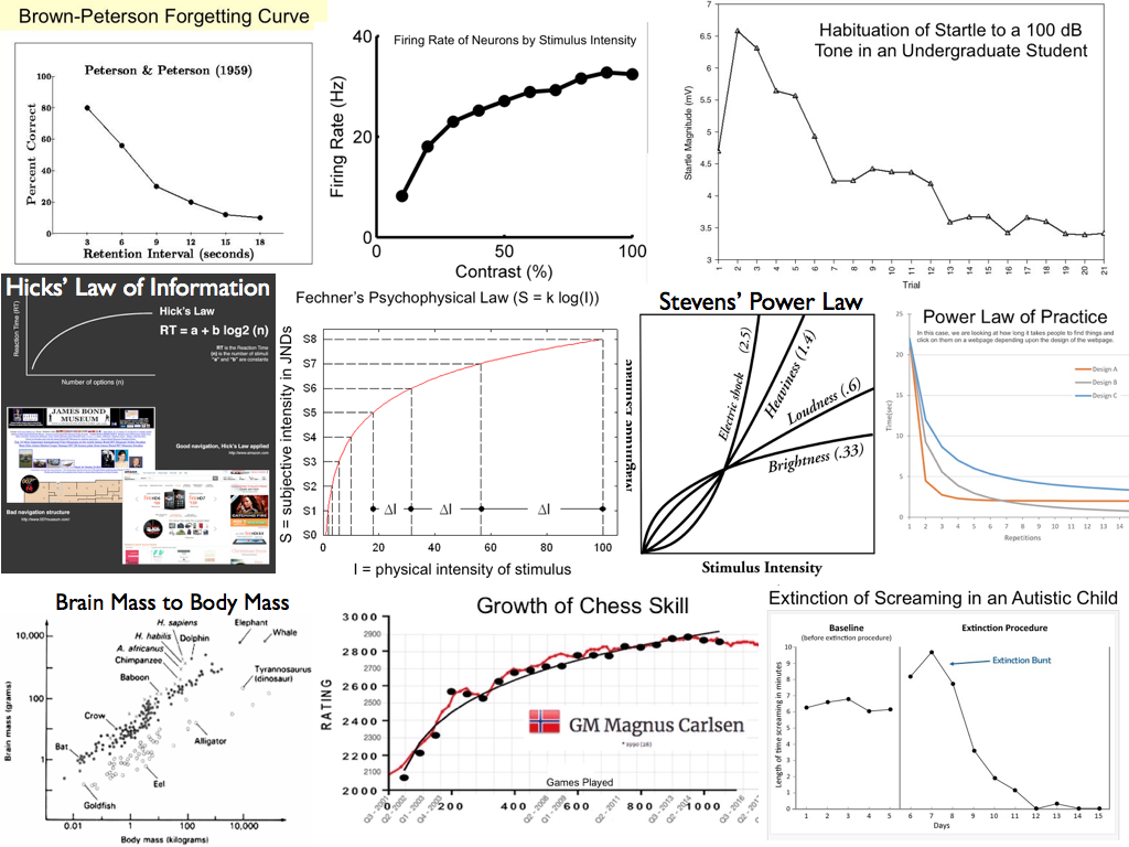
The Brown-Peterson forgetting curve was the subject of the previous exercise. We discovered, at least in Peterson's data, forgetting is an example of exponential decay, like the decay of a radioactive substance.
Proceeding left to roght, the firing rate of neurons as related to stimulus intensity has long been believed to be logarithmic. (We'll find out below.) Logarithmic functions have the property of compressing scales. For example, we want our sensory neurons to be able to detect fine differences in a stimulus when the stimulus intensity is low, but we also want them to be able to detect differences when the intensity is high. The problem is, neurons have a limited response range, whereas physical stimuli can vary in intensity over a very large range. The logarithmic function, firing.rate~log(stimulus.intensity), compresses the range of stimulus intensities into something a neuron can handle.
The next graph shows a college student habituating to a loud noise. At first, he jumps. But over repeated trials, the magnitude of the "jump" diminishes, rapidly at first and then more slowly as it approaches an asymptote.
On the second line, we begin with Hick's law of information, which states that the time it takes to respond to a situation is a logarithmic function of how much information there is to process. It's hard to read the two examples, but the first is the James Bond Museum in Sweden, which is offered as a bad example of information load. Information overload makes it difficult for visitors to decide where to go next. A well designed webpage is offered as a good example.
The next image is Fechner's psychophysical law, which states that the change in subjective intensity of a stimulus is a logarithmic function of the change in physical intensity. Stevens' power law is a modification of Fechner's law. Stevens claimed that the relationship is actually log-log, or a power function. Notice that for a stimulus such as brightness of a light, something like Fechner's law appears to hold, but for electric shock the perceived intensity increases ever more rapidly as the physical intensity goes up.
The last image on the second line is the power law of practice. Here the example is how long it takes a web surfer to find and click on something on a webpage as a function of number of attempts. This is being tested for three websites with differing designs.
On the last line we begin with brain mass to body mass. You may be thinking, "That looks linear to me!" You have to look at the axes. Notice they don't increase additively. That is, they don't go 1, 2, 3..., or 10, 20, 30... Rather, the values on the axes grow by multiples. On the horizontal axis, for example, they increase from 0.01 to 1 to 100 to 10,000. That's a multiple of 100. Such axes are called logarithmic, and if both axes are logarithmic, we're looking at a power function. Here there appear to be two different power functions, one for warm-blooded animals (black dots) and one for cold-blooded animals (white dots). Brain mass to body mass is a well known example of a power function. It's also believed to have something to do with intelligence. Notice that there are several black dots "floating" above the power function trend, and when we inspect them, we find they are for chimps, humans, and dolphins.
Then we have growth of chess skill in the current chess world champion, Magnus Carlsen of Norway, as a function of number of games played. This is also said to be a power function.
Finally, extinction of screaming in an autistic child looks like another example of exponential decay after an initial extinction burst. Old learning theorists called the extinction burst a frustration effect. If we take away an expected or accustomed reward, there is burst of responding before extinction begins to take place, like what happens to you when you put your money in a soda machine, but it is sold out, and when you press the coin return button, nothing happens. Don't tell me you haven't done it! There is a burst of presses on the coin return button before you walk away. Applied behavior therapists treating autistic children (or even normal children with a maladaptive habit) have to tell the parents to be patient and hang in there, because when you put your child on extinction, things will get worse before they get better. After the extinction burst, the exponential decay part of extinction sets in and the child's behavior rapidly improves.
Those are just the "famous" examples that came to my mind immediately. Want more examples? The literature is full of them. Here are some journal article titles I found upon a quick look through Google Scholar.
Here's one that comes with a statistical lesson.
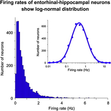
The spontaneous firing rates of neurons in the hippocampus and surrounding cortex were recorded, and then they were plotted in a frequency distribution. The result was the solid blue distribution at left. When the log of these values was taken (a log transform, notice the horizontal axis is now logarithmic, increasing by multiples of 10), the result was the normal distribution at right. Values that become normally distributed when they are log transformed are said to be log-normal distributed.
The log-normal distribution is common and often requires us to log transform
variables to meet normal distribution assumptions of our statistical procedures.
Variables that tend to be log-normal distributed include:
a) the length of comments posted in internet forums
b) users' dwell time on online articles
c) the length of games like chess games
d) puzzle-solving times, such as for Rubik's cube
e) biological measures such as weight
f) income (provided the super rich are excluded)
g) city sizes
h) file sizes of publically available audio and video files
Not all positively skewed (skewed to the right) distributions are log-normal, but log transforms are a common way to "repair" positive skew when further statistical analysis requires something approaching a normal distribution. It does NOT work with negatively skewed distributions.
I would like to look at three data sets today, and you won't have any trouble getting them into R, because they are either short enough to enter easily by hand, or they are already in R (built in). Your job is to follow along and make sure you understand what's happening. If I were you, I'd be duplicating these analyses in R. This should work in both installed versions of R and in Rweb.
In the big image near the top of this lab, the second graph in the first row is from the following source: Gaudry, Kate S. and Reinagel, Pamela (2007). Benefits of contrast normalization demonstrated in neurons and model cells. Journal of Neuroscience, 27(30), 8071-8079. The authors state the problem clearly in the first sentence of their abstract. "The large dynamic range of natural stimuli poses a challenge for neural coding: how is a neuron to encode large differences at high contrast while remaining sensitive to small differences at low contrast?"
The following data were extracted from their graph.
   contrast hertz
1        10   8.0
2        20  18.0
3        30  23.0
4        40  25.0
5        50  27.0
6        60  28.5
7        70  29.0
8        80  31.5
9        90  33.0
10      100  32.5
The contrast variable describes how contrasty the stimulus was, from hardly at all (10) to fully black and white (100). The stimulus was a flicker over the full visual field. The hertz variable describes the firing rate of a neuron in the visual cortex of the brain in action potentials per second in response to the stimulus. Enter the data as follows.
> contrast = c(10, 20, 30, 40, 50, 60, 70, 80, 90, 100)
> hertz = c(8.0, 18.0, 23.0, 25.0, 27.0, 28.5, 29.0, 31.5, 33.0, 32.5)
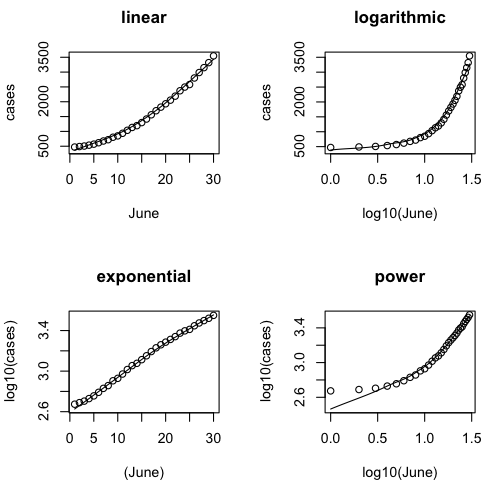
We will begin by plotting four scatterplots. Instead of using the plot() command, however, I am going to use scatter.smooth(). I'll explain why once we see the plots.
> # close the graphics window if open
> par(mfrow=c(2,2))
> scatter.smooth(hertz ~ contrast)
> title(main="linear")
> scatter.smooth(hertz ~ log(contrast))
> title(main="logarithmic")
> scatter.smooth(log(hertz) ~ contrast)
> title(main="exponential")
> scatter.smooth(log(hertz) ~ log(contrast))
> title(main="power")
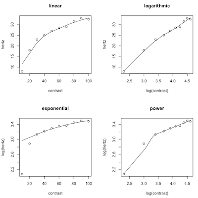
First, a minor point. We used log() in plotting these graphs because we just want to see the shape of the graph, and the type of logs doesn't matter as far as that's concerned, and log() is easier to type than log10(). We'll use log10() when we do the regression (although I suspect a real physiologist would use natural, base e, logs here).
The scatter.smooth() function plots the same scatterplot that we would get from plot(), but with a lot fewer options. It also plots R's best guess as to what the regression line or curve is. It is not the least squares line. It's called a "lowess line" or "lowess smoother." Lowess stands for "locally weighted scatterplot smoother." (Write that down! You are taking notes, right?) There is no regression equation that goes with it. It is a computer intensive nonparametric technique. "Computer intensive" means the computer tries over and over again, perhaps 1000 or even 10000 times, to hit on a "correct" answer and eventually chooses the one it thinks is best. (Write it down!)
What we are looking for is for the points to be in a straight line on one of these graphs. That will tell us what the best model is. In the first plot, we did no transforms on either variable, assuming the relationship is linear. The graph in the upper left corner tells us that is clearly wrong. In the second plot, we did a log transform on contrast, the IV, assuming the relationship is logarithmic. That appears to be good but not perfect, although that first point is going to cause us problems (upper right). In the third plot, we did the log transform on hertz, the DV, assuming the relationship was exponential (lower left). That is so clearly wrong that even the lowess line can't keep up with the points falling off the left end of it! Finally, in the fourth plot, we log transformed both the IV and DV, assuming a power function, and clearly got it wrong again (lower right).
Which function appears to be best? I will use log10() to do the analysis for the sake of those of you who do not remember what a natural log is. (But if you're thinking of going on in anything related to neuroscience, you would be wise to review natural logs!)
> lm.out = lm(hertz ~ log10(contrast))
> summary(lm.out)

Call:
lm(formula = hertz ~ log10(contrast))

Residuals:
    Min      1Q  Median      3Q     Max
-1.8455 -0.8020  0.1716  0.6608  1.7319

Coefficients:
                Estimate Std. Error t value Pr(>|t|)
(Intercept)      -14.095      2.061  -6.838 0.000133 ***
log10(contrast)   23.941      1.225  19.550 4.87e-08 ***
---
Signif. codes:  0 '***' 0.001 '**' 0.01 '*' 0.05 '.' 0.1 ' ' 1

Residual standard error: 1.17 on 8 degrees of freedom
Multiple R-squared:  0.9795,	Adjusted R-squared:  0.9769
F-statistic: 382.2 on 1 and 8 DF,  p-value: 4.871e-08
The residuals are small, considering that we are trying to predict a variable (hertz) with a range of 25. What is the largest residual, either positive or negative? What is the magnitude of a typical residual? Which may be either positive or negative. Clearly, the logarithmic model is significantly better than using mean(hertz) as the prediction. Summarize the result of a statistical test that tells us this. What percent of the total variability in hertz is being accounted for by its relationship to log(contrast)?
Enter the regression equation here:
> confint(lm.out)
                    2.5 %    97.5 %
(Intercept)     -18.84863 -9.341849
log10(contrast)  21.11684 26.764574
Both coefficients are easily significantly different from zero, as the confidence intervals confirm (see the p-values in the coefficients table, too). The negative coefficient for the slope is disturbing as it's not possible to have a negative firing rate but, once again, it's a statistical model and not the real world. Another point about that--the intercept is not the prediction for contrast=0, it's the prediction for log10(contrast)=0. For what value of a variable does its log equal 0?
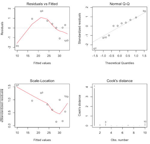
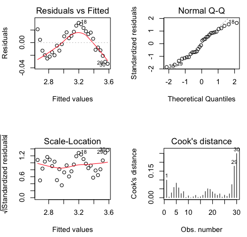
If you still have the graphics window open showing the four scatterplots, plotting the regression diagnostics requires a single command only. If you've closed that window, then you'll have to repeat the par() command as above.
> plot(lm.out, 1:4)
The diagnostics are not pretty. We have violations in every graph, and it's that first point (contrast=10) that's causing all the trouble. Nevertheless, the logarithmic model is theoretically correct.
Which graphs show which violations?
Uncontained epidemics spread exponentially, or so they say. I was following the number of COVID-19 cases in Horry County for a while last Spring and Summer. Here are the data for the month of June.
Clear your workspace and enter these data. The variable "cases" will be our response variable (DV) and is the cumulative number of cases reported to SCDHEC during June. While you're typing those, when you come to the right side of your R Console window, just hit Enter. The line will wrap, you will get the + continuation prompt on the next line, and you can continue typing. IMPORTANT: On a Mac, you no doubt have noticed that the editor automatically closes quotes and parentheses for you when you open them. That can be convenient. It can also be a nuisance. In this case, it's a nuisance. Be sure you erase the close parenthesis before hitting Enter, or Return on a Mac. Otherwise, R will think you have typed a complete command and won't allow you to continue. Or you can just keep typing and the editor in the Mac version of R will wrap the line for you. You can also enter cases using the scan() function, if you remember how.
Rather than typing out the numbers 1 through 30 for the days of June, I am entering them using the seq() function, which can be used to enter regular sequences of numbers such as 1 through 30.
> cases = c(472, 489, 506, 536, 570, 618, 676, 720, 803, 849, 936, 1037, 1133,
            1194, 1297, 1417, 1560, 1697, 1818, 1931, 2054, 2189, 2370, 2495,
            2580, 2801, 2985, 3150, 3319, 3547)
> June = seq(from=1, to=30, by=1)
Let's plot our four scatterplots, and for the log10() purists, I'll use log10() this time, although it doesn't really matter. We'll use log10() in the regression, although an epidemiologist would probably use natural logs.
> par(mfrow=c(2,2))
> scatter.smooth(cases~June, main="linear")
> scatter.smooth(cases~log10(June), main="logarithmic")
> scatter.smooth(log10(cases)~June, main="exponential")
> scatter.smooth(log10(cases)~log10(June), main="power")
Were like the epidemiologists correct? Is the exponential model the best?
So let's get to it.
> lm.out = lm(log10(cases) ~ June)
> summary(lm.out)

Call:
lm(formula = log10(cases) ~ June)

Residuals:
      Min        1Q    Median        3Q       Max
-0.033597 -0.014703  0.001044  0.016265  0.031352

Coefficients:
             Estimate Std. Error t value Pr(>|t|)
(Intercept) 2.6206365  0.0072667  360.64   <2e-16 ***
June        0.0320941  0.0004093   78.41   <2e-16 ***
---
Signif. codes:  0 '***' 0.001 '**' 0.01 '*' 0.05 '.' 0.1 ' ' 1

Residual standard error: 0.01941 on 28 degrees of freedom
Multiple R-squared:  0.9955,	Adjusted R-squared:  0.9953
F-statistic:  6148 on 1 and 28 DF,  p-value: < 2.2e-16
It looks like we've nailed this one! R-squared = 0.9955. You don't get much better than that! Let's look at the diagnostics. Assuming you left the graphics window open (otherwise, do the par() thing first)...
plot(lm.out, 1:4)
It looks like we missed a bit of the curvilinear relationship, but only a tiny bit (see how small the values are on the vertical axis). Normality and homogeneity look okay (over all), and there are no Cook's distances greater than about 0.25, although the Cook's distances are starting to get large towards the end of the month. Could our model be starting to fail there?
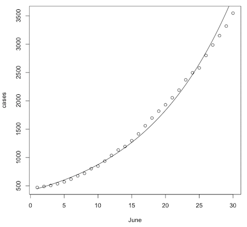
Let's draw a scatterplot and plot the regression equation on it. First, close the graphics window so that R will reset the graphics parameters.
> plot(cases ~ June)
The regression equation is...
log10(cases.hat) = 2.621 + 0.0321 * June
Or, taking the antilog of both sides...
cases.hat = 10^(2.621 + 0.0321 * June)
Now we'll plot that on the scatterplot.
> curve(10^(2.621 + 0.0321 * x), from=1, to=30, add=T)
It does look like the number of cases is snaking around the regression curve in a systematic way. They are not randomly scattered around the regression curve. Maybe the exponential model isn't quite right, or maybe the epidemic wasn't entirely uncontained. Still, it is a scary model! Let's use it to predict the number of cases to expect by August 1st, which would be day 62 in this model.
> 10^(2.621 + 0.0321 * 62)
[1] 40850.75
Yikes! Thank goodness that didn't come true!! But that's the key characteristic of exponential growth. It goes slowly at first, but eventually it becomes explosive. Watch this video for more on exponential growth of pandemics. By the way, when they talk about "flattening the curve," this is the curve they are talking about. When this curve goes flat, it means the number of cases is no longer increasing, i.e., there are no new cases.
Clear your workspace and close the graphics window.
One of the things that's always disappointed me about history classes is that they don't talk about the psychological impact of historical events. And they tend not to talk about scientific events at all, when scientific discoveries often have a greater impact on the future course of things than wars and generals and emperors do. Case in point...
In the late 16th and early 17th centuries, some scientific discoveries were made that would forever change our view of the role of human beings in the universe. Before about 1550, we viewed ourselves as being at the center of the universe. Of course, we also viewed ourselves as the only imperfect part of the universe. Only on earth could decay and corruption occur. The rest of the universe, which consisted of the moon, the sun, the five known planets, the visible stars, and an occasional comet, was considered to be perfect. All of that other stuff revolved in orbits around the earth, and orbits had to be perfect circles. Anything else would be an imperfection. After about 1650, that view was no longer possible.
Copernicus was the first person known at the time to propose that the sun is actually the center of things and that the earth orbits the sun as one of the planets. It's probably a good thing he died before his work became widely known. Galileo made the observations that confirmed Copernicus's theory, and he was threatened with excommunication from the Church if he didn't recant, and possibly worse. Thus, we were moved out of the center of things. He also discovered spots on the sun. Gasp! Now, about those perfect orbits...
Johannes Kepler proposed his first two laws of planetary motion in the very early 1600s, which state that planetary orbits are not perfect circles but ellipses. It took him ten years to to come up with his third law, which states the relationship between a planet's distance from the sun and the time it takes to make a complete orbit of the sun (its orbital period). It's too bad Kepler didn't have R, because by making use of R, we're going to do it in ten minutes.
(Aside: Kepler's laws led to Newton's laws of motion and theory of universal gravitation, which led to Einstein's theory of relativity and quantum mechanics, which led to the space program and modern electronics, which allow you to have a digital television, a computer, Internet, and a smart phone today. I defy you to name any emporer or president who has had a greater impact on your life.)
Enter the following variables into R. I'll leave off the command prompts so you can copy and paste.
planets = c("Mercury", "Venus", "Earth", "Mars", "Ceres", "Jupiter", "Saturn",
            "Uranus", "Neptune", "Pluto")
dist = c(0.39, 0.72, 1.00, 1.52, 2.77, 5.20, 9.54, 19.18, 30.07, 39.44)
period = c(0.24, 0.62, 1.00, 1.88, 4.60, 11.86, 29.46, 84.01, 164.79, 248.43)
The distance is in units of earth distance (astronomical units for those who have never had a course in astronomy). The period is in earth years. In other words, the data you saw in the previous exercise has been transformed in the way I suggested. Using these units of measurement will make our result especially elegant. Rather than leaving those variables lingering in the workspace, we're going to put them into a data frame and then erase them from the workspace.
> Kepler = data.frame(dist, period)
> rownames(Kepler) = planets
> rm(planets, dist, period)
> Kepler
The last of those commands should reveal this.
         dist period
Mercury  0.39   0.24
Venus    0.72   0.62
Earth    1.00   1.00
Mars     1.52   1.88
Ceres    2.77   4.60
Jupiter  5.20  11.86
Saturn   9.54  29.46
Uranus  19.18  84.01
Neptune 30.07 164.79
Pluto   39.44 248.43
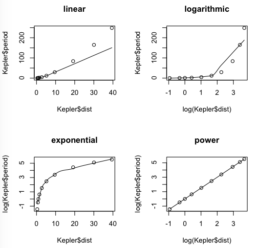
Let's begin with our usual four scatterplots. The scatter.smooth() function will not take the data= option, so we will have to use the $ notation. (Don't ask me why. It seems like an oversight to me.) I'm just going to go ahead and use log(), because in the end it's not going to make any difference.
> # close the graphics window if open
> par(mfrow=c(2,2))
> scatter.smooth(Kepler$period ~ Kepler$dist, main="linear")
> scatter.smooth(Kepler$period ~ log(Kepler$dist), main="logarithmic")
> scatter.smooth(log(Kepler$period) ~ Kepler$dist, main="exponential")
> scatter.smooth(log(Kepler$period) ~ log(Kepler$dist), main="power")
I don't think we're going to get anything better than that power function.
> lm.out = lm(log(period) ~ log(dist), data=Kepler)
> summary(lm.out)

Call:
lm(formula = log(period) ~ log(dist), data = Kepler)

Residuals:
       Min         1Q     Median         3Q        Max
-0.0138453 -0.0017457 -0.0006386  0.0012032  0.0152638

Coefficients:
              Estimate Std. Error t value Pr(>|t|)
(Intercept) -0.0003749  0.0032092  -0.117     0.91
log(dist)    1.5005132  0.0015330 978.839   <2e-16 ***
---
Signif. codes:  0 '***' 0.001 '**' 0.01 '*' 0.05 '.' 0.1 ' ' 1

Residual standard error: 0.0075 on 8 degrees of freedom
Multiple R-squared:      1,	Adjusted R-squared:      1
F-statistic: 9.581e+05 on 1 and 8 DF,  p-value: < 2.2e-16
R-squared is 1. When are you ever going to see that again? The intercept is virtually zero, and we will round it to zero. The slope is 1.5. Let's write the regression equation.
log(period.hat) = 1.5 * log(dist)
The zero intercept just drops out, of course. Now we'll do the antilog of both sides of that equation, and I'm going to drop the hat from period.hat, because this is a physical law we are dealing with here and not just a statistical relationship. These are natural logs, so the antilog involves the mathematical constant e instead of 10, but if you want to redo this using log10(), you'll see it makes no difference.
e^log(period) = e^(1.5 * log(dist))
period = dist^1.5
And squaring both sides...
period^2 = dist^3
Kepler's 3rd law: The square of the period is proportional to the cube of the distance. Equal to in this case because of the units of measurement we used.
Clear your workspace, close the graphics window, and do this.
library("MASS")   # attaches another package to the search path
data(Animals)   # retrieves a built-in data set
summary(Animals)
These are body and brain sizes of 28 species of animals. Body size is in kilograms. Brain size is in grams. (No, the different units doesn't matter.) You should be able to tell that both of these variables are strongly positively skewed because the means are larger than the 3rd quartile. That's skew! The skew is so bad, in fact, that a scatterplot reveals nothing! Try doing this to resolve that problem. This will plot the scatterplot on logarithmic axes.
plot(brain ~ body, data=Animals, log="x")   # same as doing log(body)
plot(brain ~ body, data=Animals, log="y")   # same as doing log(brain)
plot(brain ~ body, data=Animals, log="xy")   # same as doing both transforms
Get the regression equation, the value of R-squared, and the identity of the three outlying points. The answers will be posted here.